- Get data (two xls files) from here:
- Load data and look at structure (str)
- Head (first few lines)
- AUC, N1P1, Latency
- Summary of eel and cobra AUC
- What kind of time points or conditions or whatever do we have again?
- Summary by pig and region
- Plot AUC by time and region and pig
- Prettier plot with lines and more formatting
- N1P1 Plot
- Latency plot
- Bonus
Data from Aaron Rising.
Get data (two xls files) from here:
- https://github.com/davemcg/Let_us_plot/tree/master/002_smoothed_lines
- The rmd is also here if you want the source code
Two different excel files (Cobra and Eel). Pig names?
They have metrics for eye function across time.
Aaron told me to take the ‘first tab’ in each excel file. Which is not the case, as at least to me, ‘Sheet 1’ is empty in both. So I’m using the next tab in both, which is ‘Normalized 2 Base For Comb’
Load data and look at structure (str)
library(tidyverse)## ── Attaching packages ────────────────────────────────────────────────────────────────────────────────── tidyverse 1.2.1 ──## ✔ ggplot2 3.0.0 ✔ purrr 0.2.5
## ✔ tibble 1.4.2 ✔ dplyr 0.7.6
## ✔ tidyr 0.8.1 ✔ stringr 1.3.1
## ✔ readr 1.1.1 ✔ forcats 0.3.0## ── Conflicts ───────────────────────────────────────────────────────────────────────────────────── tidyverse_conflicts() ──
## ✖ dplyr::filter() masks stats::filter()
## ✖ dplyr::lag() masks stats::lag()library(ggsci)
cobra <- readxl::read_xls('~/git/Let_us_plot/002_smoothed_lines/Cobra 749--_Normalized_Data_.xls', sheet = 'Normalized 2 Base For Comb')
cobra %>% str()## Classes 'tbl_df', 'tbl' and 'data.frame': 187 obs. of 8 variables:
## $ Pig_Name : chr "Cobra 749" "Cobra 749" "Cobra 749" "Cobra 749" ...
## $ Week : num 0 0 0 0 0 0 0 0 0 0 ...
## $ Region : chr "Healthy_Implant" "Healthy_Implant" "Healthy_Implant" "Healthy_Implant" ...
## $ Cells : logi FALSE FALSE FALSE FALSE FALSE FALSE ...
## $ Output : chr "Area-Under-Curve" "HFC-Scalar" "LFC-Scalar" "N1" ...
## $ GroupCount: num 3 3 3 3 3 3 3 3 3 3 ...
## $ Data : num 1 1 1 1 15.7 ...
## $ STD : num 0.0994 0.3493 0.2259 0.1063 0.5774 ...eel <- readxl::read_xls('~/git/Let_us_plot/002_smoothed_lines/Eel 668--_Normalized_Data_.xls', sheet = 'Normalized 2 Base For Comb')
eel %>% str()## Classes 'tbl_df', 'tbl' and 'data.frame': 192 obs. of 8 variables:
## $ Pig_Name : chr "Eel 668" "Eel 668" "Eel 668" "Eel 668" ...
## $ Week : num 0 0 0 0 0 0 0 0 0 0 ...
## $ Region : chr "Healthy_Sham" "Healthy_Sham" "Healthy_Sham" "Healthy_Sham" ...
## $ Cells : logi FALSE FALSE FALSE FALSE FALSE FALSE ...
## $ Output : chr "Area-Under-Curve" "HFC-Scalar" "LFC-Scalar" "N1" ...
## $ GroupCount: num 3 3 3 3 3 3 3 3 3 3 ...
## $ Data : num 1 1 1 1 20.7 ...
## $ STD : num 0.0537 0.5141 0.1355 0.0631 0.5774 ...Head (first few lines)
cobra %>% head()## # A tibble: 6 x 8
## Pig_Name Week Region Cells Output GroupCount Data STD
## <chr> <dbl> <chr> <lgl> <chr> <dbl> <dbl> <dbl>
## 1 Cobra 749 0 Healthy_Implant FALSE Area-Unde… 3 1 0.0994
## 2 Cobra 749 0 Healthy_Implant FALSE HFC-Scalar 3 1. 0.349
## 3 Cobra 749 0 Healthy_Implant FALSE LFC-Scalar 3 1 0.226
## 4 Cobra 749 0 Healthy_Implant FALSE N1 3 1. 0.106
## 5 Cobra 749 0 Healthy_Implant FALSE N1-Latency 3 15.7 0.577
## 6 Cobra 749 0 Healthy_Implant FALSE N1-Prom 3 1 0.177eel %>% head()## # A tibble: 6 x 8
## Pig_Name Week Region Cells Output GroupCount Data STD
## <chr> <dbl> <chr> <lgl> <chr> <dbl> <dbl> <dbl>
## 1 Eel 668 0 Healthy_Sham FALSE Area-Under-Cu… 3 1 0.0537
## 2 Eel 668 0 Healthy_Sham FALSE HFC-Scalar 3 1. 0.514
## 3 Eel 668 0 Healthy_Sham FALSE LFC-Scalar 3 1 0.135
## 4 Eel 668 0 Healthy_Sham FALSE N1 3 1. 0.0631
## 5 Eel 668 0 Healthy_Sham FALSE N1-Latency 3 20.7 0.577
## 6 Eel 668 0 Healthy_Sham FALSE N1-Prom 3 1. 0.0781Looks like we have implant (cobra) vs sham (eel)?
We have several types of Output (Area-Under-Curve, HFC-Scalar, LFC-Scalar, N1, N1-Latency, N1-Prom, N1-Width, N1P1, N2, N2-Latency, N2-Prom, N2-Width, N2P2, P1, P1-Latency, P1-Prom, P1-Width, P1N2, P2, P2-Latency, P2-Prom, P2-Width, Pos.-Area-Under-Curve, RMS-HFC) which are different variables that have been measured. I asked Aaron what he cared most about and he suggested AUC, N1P1, and Latency
AUC, N1P1, Latency
We need to get the exact names for those variables
We can extract all of the Output values and only print the unique ones
eel$Output %>% unique()## [1] "Area-Under-Curve" "HFC-Scalar"
## [3] "LFC-Scalar" "N1"
## [5] "N1-Latency" "N1-Prom"
## [7] "N1-Width" "N1P1"
## [9] "N2" "N2-Latency"
## [11] "N2-Prom" "N2-Width"
## [13] "N2P2" "P1"
## [15] "P1-Latency" "P1-Prom"
## [17] "P1-Width" "P1N2"
## [19] "P2" "P2-Latency"
## [21] "P2-Prom" "P2-Width"
## [23] "Pos.-Area-Under-Curve" "RMS-HFC"OK, so Area-Under-Curve, N1P1, and N1-Latency are the three variables we’ll take a look at. Or fewer if I get confused.
Let’s start by just looking at AUC. Generically it is a machine learning measure of how often an algorithm will distinguish the right answer over the wrong one. 1 is perfect. 0 is perfect wrong. 0.5 is a monkey flipping coins. Not sure what it means here.
Summary of eel and cobra AUC
Get the summary data from just the AUC values for each pig
cobra %>% filter(Output == 'Area-Under-Curve') %>% pull(Data) %>% summary()## Min. 1st Qu. Median Mean 3rd Qu. Max.
## 0.3653 0.4629 0.6895 0.6989 0.9675 1.0000eel %>% filter(Output == 'Area-Under-Curve') %>% pull(Data) %>% summary()## Min. 1st Qu. Median Mean 3rd Qu. Max.
## 0.6022 0.7717 0.9596 0.8698 0.9959 1.0000So the sham (eel) has a better AUC?
What kind of time points or conditions or whatever do we have again?
cobra %>% filter(Output == 'Area-Under-Curve')## # A tibble: 8 x 8
## Pig_Name Week Region Cells Output GroupCount Data STD
## <chr> <dbl> <chr> <lgl> <chr> <dbl> <dbl> <dbl>
## 1 Cobra 749 0 Healthy_Implant FALSE Area-Unde… 3 1 0.0994
## 2 Cobra 749 14 Healthy_Implant FALSE Area-Unde… 3 0.690 0.0877
## 3 Cobra 749 35 Healthy_Implant FALSE Area-Unde… 3 0.689 0.119
## 4 Cobra 749 58 Healthy_Implant FALSE Area-Unde… 3 0.957 0.208
## 5 Cobra 749 0 Implant_NoLx FALSE Area-Unde… 3 1 0.0868
## 6 Cobra 749 14 Implant_NoLx FALSE Area-Unde… 3 0.365 0.0964
## 7 Cobra 749 35 Implant_NoLx FALSE Area-Unde… 3 0.409 0.102
## 8 Cobra 749 58 Implant_NoLx FALSE Area-Unde… 3 0.481 0.212Oh, we have two kinds or regions. Didn’t see that before. So the above summary doesn’t take that into account.
Summary by pig and region
This summary is group_by(Region) so we’ll get summary data (mean and median) by Region now
cobra %>% filter(Output == 'Area-Under-Curve') %>% group_by(Region) %>% summarise(mean = mean(Data), median= median(Data))## # A tibble: 2 x 3
## Region mean median
## <chr> <dbl> <dbl>
## 1 Healthy_Implant 0.834 0.823
## 2 Implant_NoLx 0.564 0.445eel %>% filter(Output == 'Area-Under-Curve') %>% group_by(Region) %>% summarise(mean = mean(Data), median= median(Data))## # A tibble: 2 x 3
## Region mean median
## <chr> <dbl> <dbl>
## 1 Healthy_Sham 0.978 0.992
## 2 Implant-Sham 0.761 0.721We also have time (Week). This will be our x axis when we plot, as this data is sampled across time
Plot AUC by time and region and pig
x axis is time, y axis is AUC, and split by region/pig
cobra_eel_AUC <- rbind(cobra %>% filter(Output == 'Area-Under-Curve'),
                       eel %>% filter(Output == 'Area-Under-Curve'))
cobra_eel_AUC %>%
  ggplot(aes(x=Week, y=Data, shape=Region, colour=Region)) +
   geom_point()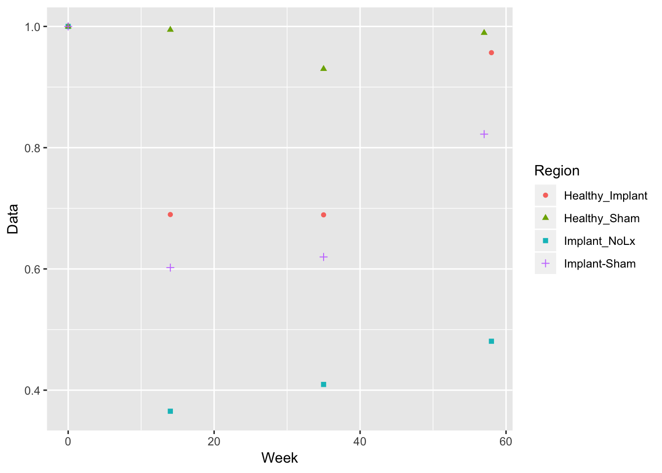
Prettier plot with lines and more formatting
Using the ggsci library with the Nature Publishing Group color scheme (scale_colour_npg())
cobra_eel_AUC %>%
  ggplot(aes(x=Week, y=Data, colour=Region, shape = Pig_Name)) +
  geom_point(size=4) +
  geom_smooth(method = 'loess') + ## this draws the smoothed lines through the four points. It auto picks an algorithm that works. loess was used here
  theme_bw() + scale_colour_npg() +
ylab('AUC') 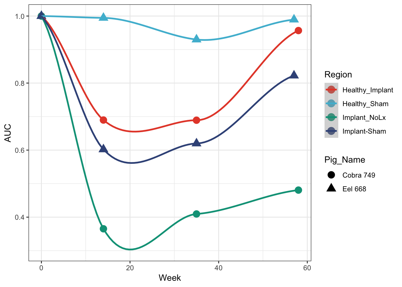
N1P1 Plot
rbind(cobra %>% filter(Output == 'N1P1'), eel %>% filter(Output == 'N1P1')) %>%
  ggplot(aes(x=Week, y=Data, colour=Region, shape = Pig_Name)) +
  geom_point(size=4) +
  geom_smooth() + ## this draws the smoothed lines through the four points. It auto picks an algorithm that works. loess was used here
  theme_bw() + scale_colour_npg() +
  ylab('N1P1')
## `geom_smooth()` using method = 'loess' and formula 'y ~ x'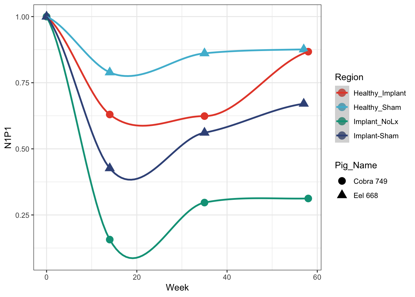
Latency plot
rbind(cobra %>% filter(Output == 'N1-Latency'), eel %>% filter(Output == 'N1-Latency')) %>%
  ggplot(aes(x=Week, y=Data, colour=Region, shape = Pig_Name)) +
  geom_point(size=4) +
  geom_smooth() + ## this draws the smoothed lines through the four points. It auto picks an algorithm that works. loess was used here
  theme_bw() + scale_colour_npg() +
  ylab('N1-Latency')
## `geom_smooth()` using method = 'loess' and formula 'y ~ x'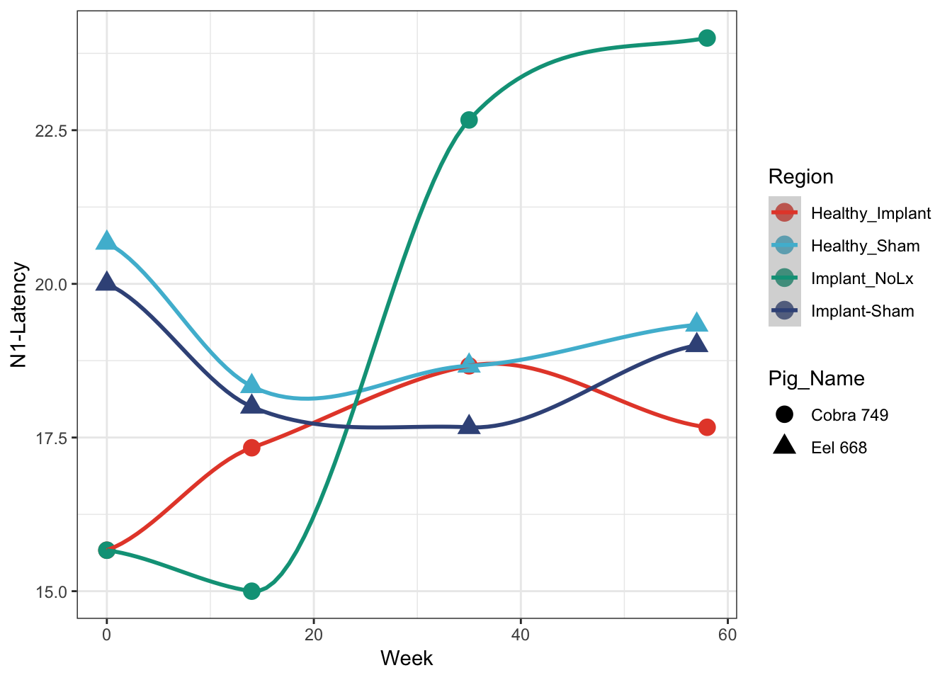
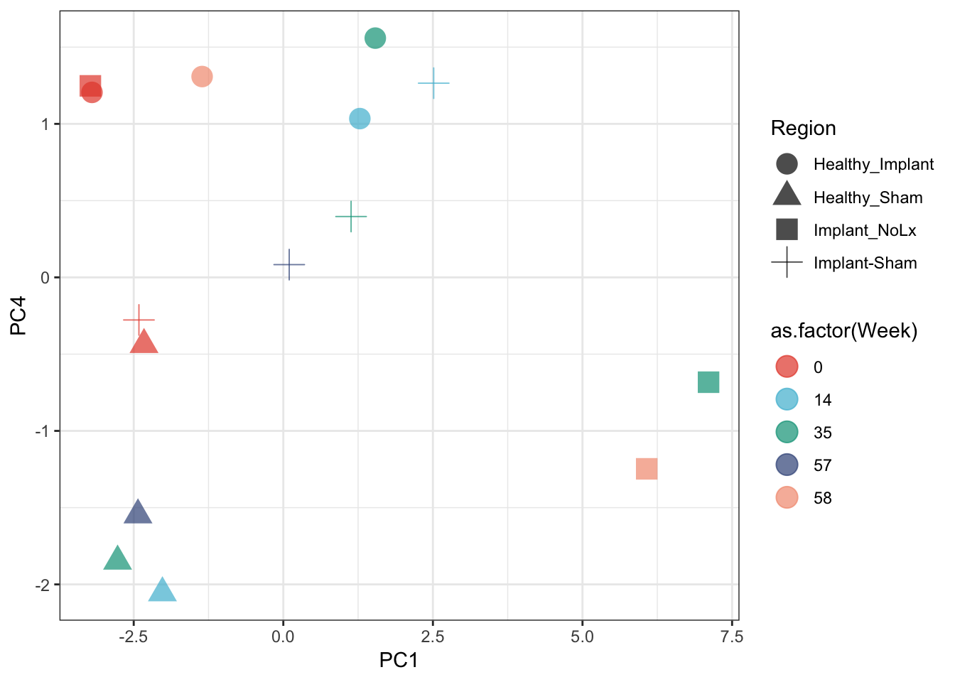
Bonus
We have many variables. We can get a quick sense of how all of the variables separate out the major data categories with a PCA
all_pigs <- rbind(cobra, eel) %>%
  select(Region, Pig_Name, Week, Output, Data) %>%
  spread(Output, Data)
## toss P-Prime-Latency column
all_pigs <- all_pigs %>% select(-`P-Prime-Latency`)
## remove columns with NA
all_pigs <- all_pigs[complete.cases(all_pigs), complete.cases(t(all_pigs))]
pca <- prcomp(all_pigs[,4:ncol(all_pigs)], scale. = T)

## pull out PCA coordinates (pca$x) and add to all_pigs with the cbind
all_pigs <- cbind(all_pigs, pca$x)

ggplot(all_pigs, aes(x=PC1, y=PC4, color=as.factor(Week), shape=Region)) +
  geom_point(size=5, alpha=0.7) +
  theme_bw() +
  scale_colour_npg()