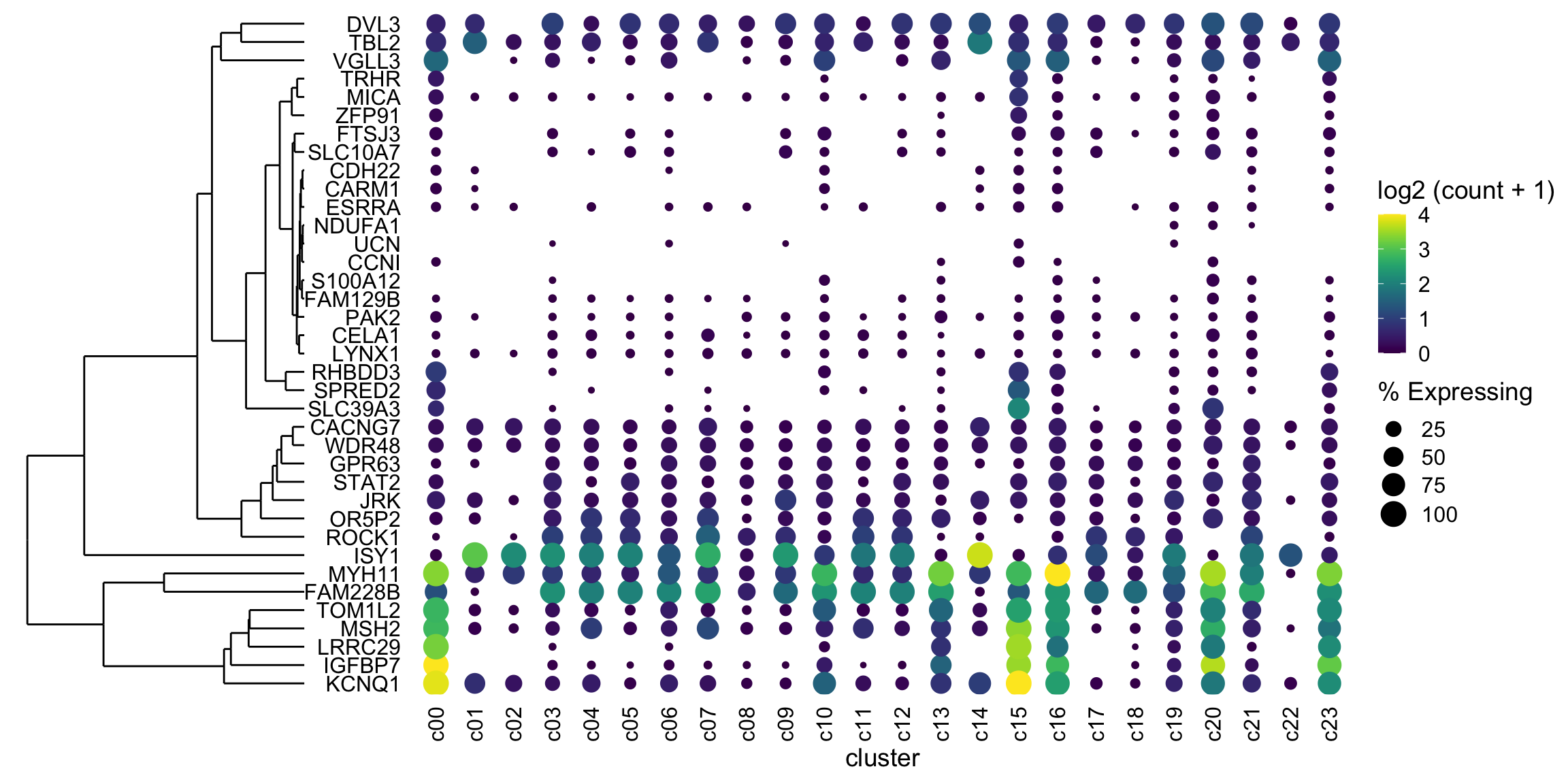
2020 03 23 Update
Ming Tang pointed out a better way to align plots, so I have rewritten the back end of this post. I’ve also made a MUCH fancier plot….
Intro
What’s a dotplot? Well, it is sort of like a heatmap where rows are genes and the columns are clusters (groups of related cells). Well, columns could be genes and rows could be clusters. I have seen both.
How is it not a heatmap? Because the size of the dot (not a square, like a heatmap) at the intersection of gene/cluster is proportionate to the fraction/percentage of cells in the cluster that express the gene. If a higher percentage of cells in the cluster express the gene (at whatever level you decide, but most use any expression), then the dot is larger.
This is useful as you can assess expression (usually mean) of the gene and the consistency of expression simultaneously.
Example dotplot
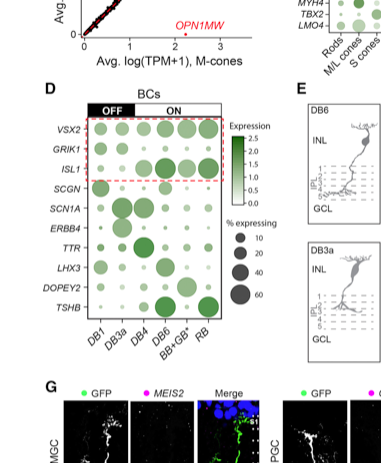 Figure 2D from Peng et al. showing expression of markers of retinal bipolar cells in different clusters (labelled as cell types).
How do I make a dotplot?
Easy, if you use Seurat: https://satijalab.org/seurat/v3.0/visualization_vignette.html
But let’s do this ourself!
This is real data, but the gene names have been randomized. The group names are made up.
I’m providing a tsv with some tidy data.
Let’s import it and see what it look like. You’ll need the five packages below installed on your computer.
library(tidyverse)## ── Attaching packages ────────────────────────────────────────────────────────────────────────────────────────────────────────────────── tidyverse 1.3.0 ──## ✓ ggplot2 3.3.0 ✓ purrr 0.3.3
## ✓ tibble 2.1.3 ✓ dplyr 0.8.4
## ✓ tidyr 1.0.2 ✓ stringr 1.4.0
## ✓ readr 1.3.1 ✓ forcats 0.5.0## ── Conflicts ───────────────────────────────────────────────────────────────────────────────────────────────────────────────────── tidyverse_conflicts() ──
## x dplyr::filter() masks stats::filter()
## x dplyr::lag() masks stats::lag()library(ggdendro)
library(cowplot)##
## ********************************************************## Note: As of version 1.0.0, cowplot does not change the## default ggplot2 theme anymore. To recover the previous## behavior, execute:
## theme_set(theme_cowplot())## ********************************************************library(ggtree) # install with `devtools::install_github("YuLab-SMU/ggtree")` as you need a version newer than what bioconductor serves## Registered S3 method overwritten by 'treeio':
## method from
## root.phylo ape## ggtree v2.1.3 For help: https://yulab-smu.github.io/treedata-book/
##
## If you use ggtree in published research, please cite the most appropriate paper(s):
##
## [36m-[39m Guangchuang Yu. Using ggtree to visualize data on tree-like structures. Current Protocols in Bioinformatics, 2020, 69:e96. doi:10.1002/cpbi.96
## [36m-[39m Guangchuang Yu, Tommy Tsan-Yuk Lam, Huachen Zhu, Yi Guan. Two methods for mapping and visualizing associated data on phylogeny using ggtree. Molecular Biology and Evolution 2018, 35(12):3041-3043. doi:10.1093/molbev/msy194
## [36m-[39m Guangchuang Yu, David Smith, Huachen Zhu, Yi Guan, Tommy Tsan-Yuk Lam. ggtree: an R package for visualization and annotation of phylogenetic trees with their covariates and other associated data. Methods in Ecology and Evolution 2017, 8(1):28-36, doi:10.1111/2041-210X.12628##
## Attaching package: 'ggtree'## The following object is masked from 'package:tidyr':
##
## expandlibrary(patchwork) ##
## Attaching package: 'patchwork'## The following object is masked from 'package:cowplot':
##
## align_plotsgene_cluster <- read_tsv('https://github.com/davemcg/davemcg.github.io/raw/master/content/post/scRNA_dotplot_data.tsv.gz')## Parsed with column specification:
## cols(
## Gene = col_character(),
## cluster = col_character(),
## cell_ct = col_double(),
## cell_exp_ct = col_double(),
## count = col_double(),
## Group = col_character()
## )gene_cluster %>% sample_n(5)## # A tibble: 5 x 6
## Gene cluster cell_ct cell_exp_ct count Group
## <chr> <chr> <dbl> <dbl> <dbl> <chr>
## 1 MYH11 c22 278 9 0.0324 Fibroblast
## 2 CARM1 c19 922 8 0.00868 Astrocyte
## 3 MICA c11 1870 22 0.0118 Astrocyte
## 4 SLC39A3 c02 3320 3 0.000904 Fibroblast
## 5 DVL3 c20 336 254 1.30 NeuronCount is the mean log2 scaled counts for the gene in that cluster
cluster is the identifier for the cluster in this scRNA experiment
cell_ct is the number of cells in the cluster
cell_exp_ct is the number of cells with detectable (>0) expression of that gene in the cluster
Group is the (made up) cell types that the clusters represent
Dotplot!
Zero effort
This is actually quite easy
It’s the details that make it complicated
markers <- gene_cluster$Gene %>% unique()

gene_cluster %>% filter(Gene %in% markers) %>%
  mutate(`% Expressing` = (cell_exp_ct/cell_ct) * 100) %>%
  ggplot(aes(x=cluster, y = Gene, color = count, size = `% Expressing`)) +
geom_point() 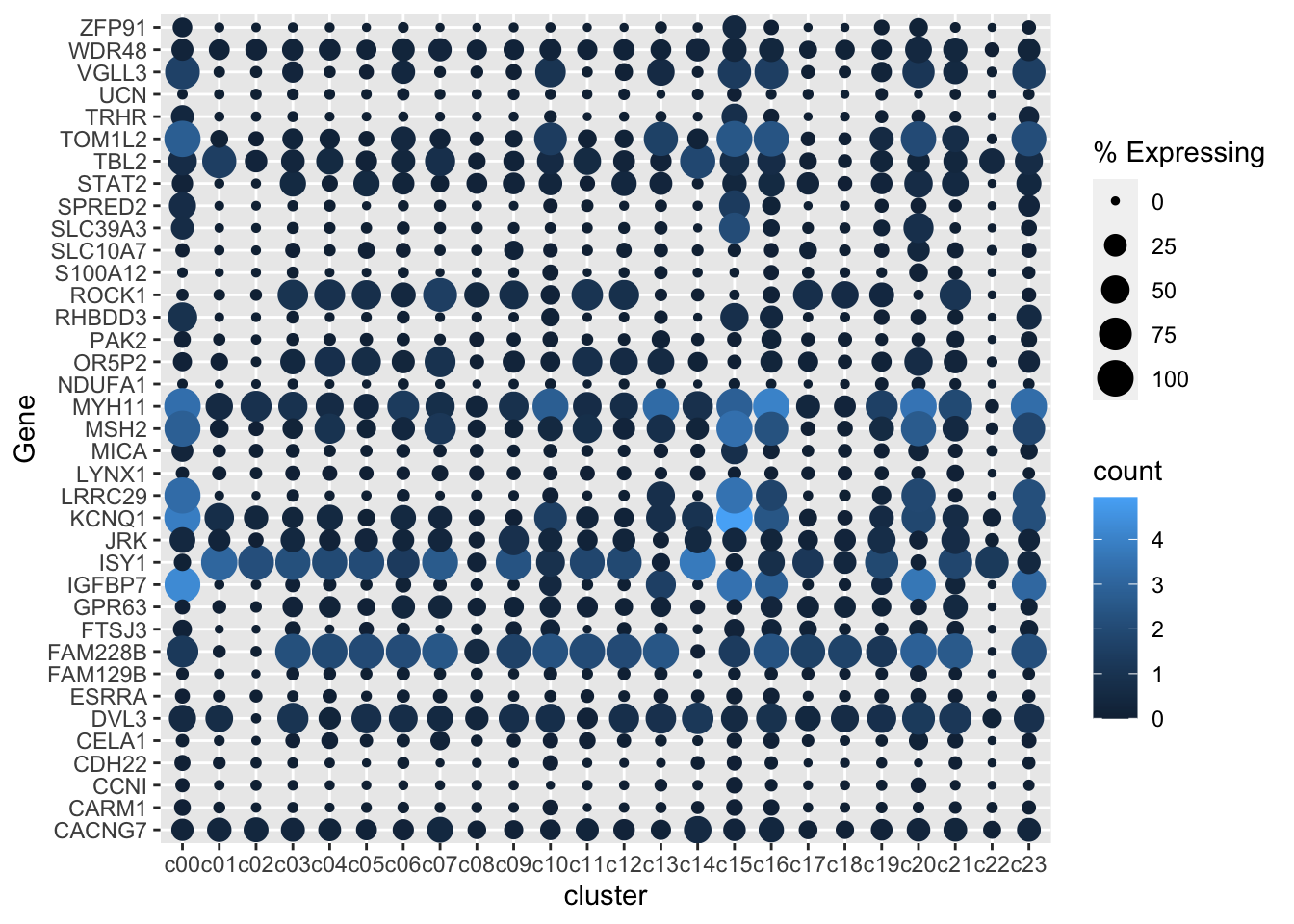
Remove dots where there is zero (or near zero expression)
There are dots for 0% expression. That’s not ideal. It would look better to have no dot at all.
Let’s remove gene - cluster with either a log2(Count+1) of 0 or less than 1% of the cells in the cluster expressing any amount of the gene.
gene_cluster %>% filter(Gene %in% markers) %>%
  mutate(`% Expressing` = (cell_exp_ct/cell_ct) * 100) %>%
  filter(count > 0, `% Expressing` > 1) %>%
  ggplot(aes(x=cluster, y = Gene, color = count, size = `% Expressing`)) +
geom_point() 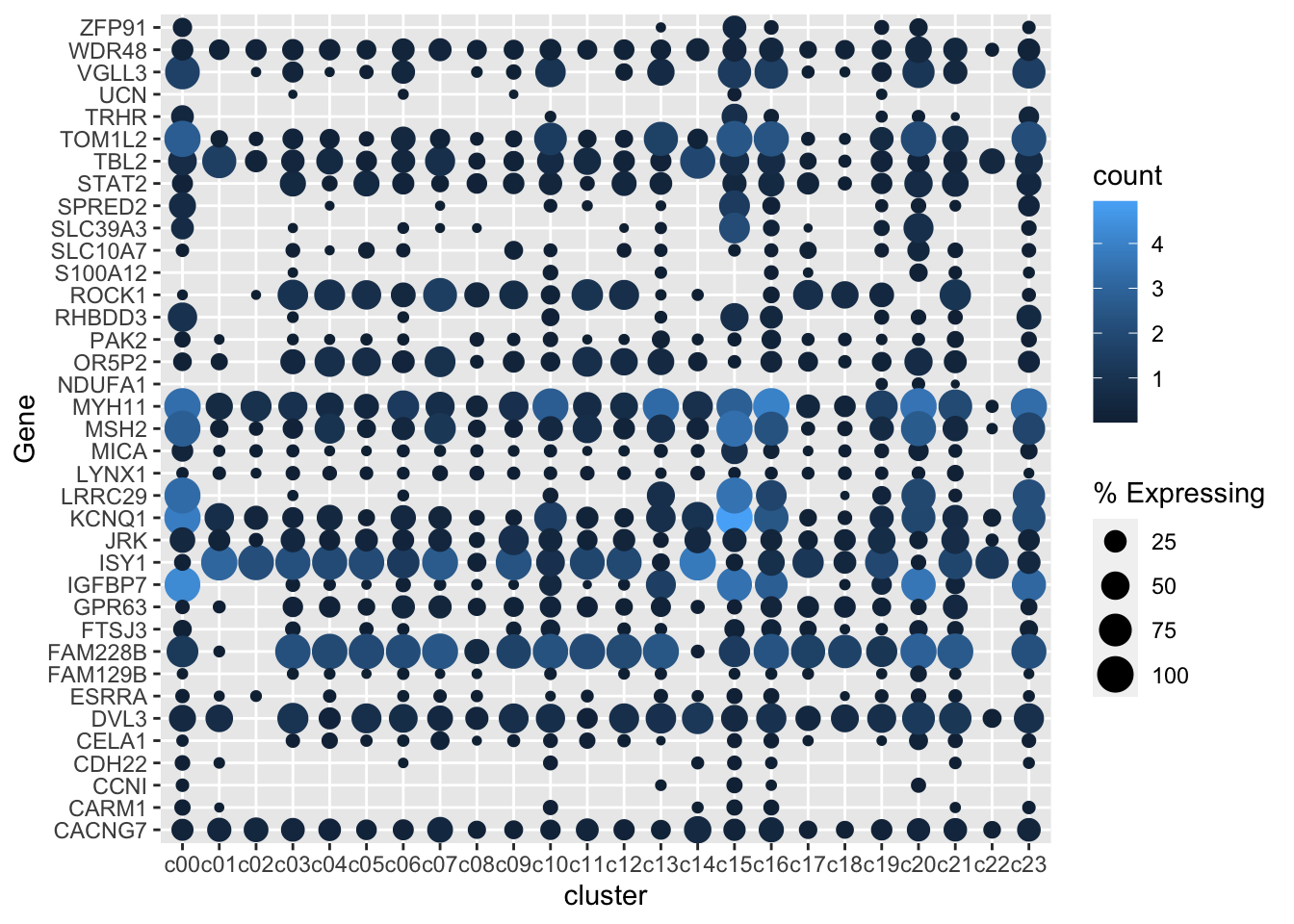
Better color, better theme, rotate x axis labels
I’m a viridis and theme_cowplot fan (I have also removed the axis lines as they aren’t really doing much here)
gene_cluster %>% filter(Gene %in% markers) %>%
  mutate(`% Expressing` = (cell_exp_ct/cell_ct) * 100) %>%
  filter(count > 0, `% Expressing` > 1) %>%
  ggplot(aes(x=cluster, y = Gene, color = count, size = `% Expressing`)) +
  geom_point() +
  scale_color_viridis_c(name = 'log2 (count + 1)') +
  cowplot::theme_cowplot() +
  theme(axis.line  = element_blank()) +
  theme(axis.text.x = element_text(angle = 90, vjust = 0.5, hjust=1)) +
  ylab('') +
theme(axis.ticks = element_blank()) 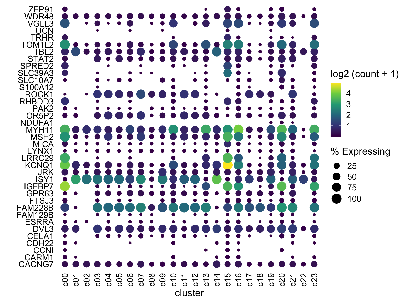
Tweak color scaling
One gene (KCNQ1 at c15) is at much higher expression than anything else. I would rather have anything at say log(count+1) ~ 4 be bright yellow. We can do this by using scale_color_gradientn with limits set to c(0,4) and have anything above 4 be “squished” down by oob = scales::squish
gene_cluster %>% filter(Gene %in% markers) %>%
  mutate(`% Expressing` = (cell_exp_ct/cell_ct) * 100) %>%
  filter(count > 0, `% Expressing` > 1) %>%
  ggplot(aes(x=cluster, y = Gene, color = count, size = `% Expressing`)) +
  geom_point() +
  cowplot::theme_cowplot() +
  theme(axis.line  = element_blank()) +
  theme(axis.text.x = element_text(angle = 90, vjust = 0.5, hjust=1)) +
  ylab('') +
  theme(axis.ticks = element_blank()) +
  scale_color_gradientn(colours = viridis::viridis(20), limits = c(0,4), oob = scales::squish, name = 'log2 (count + 1)')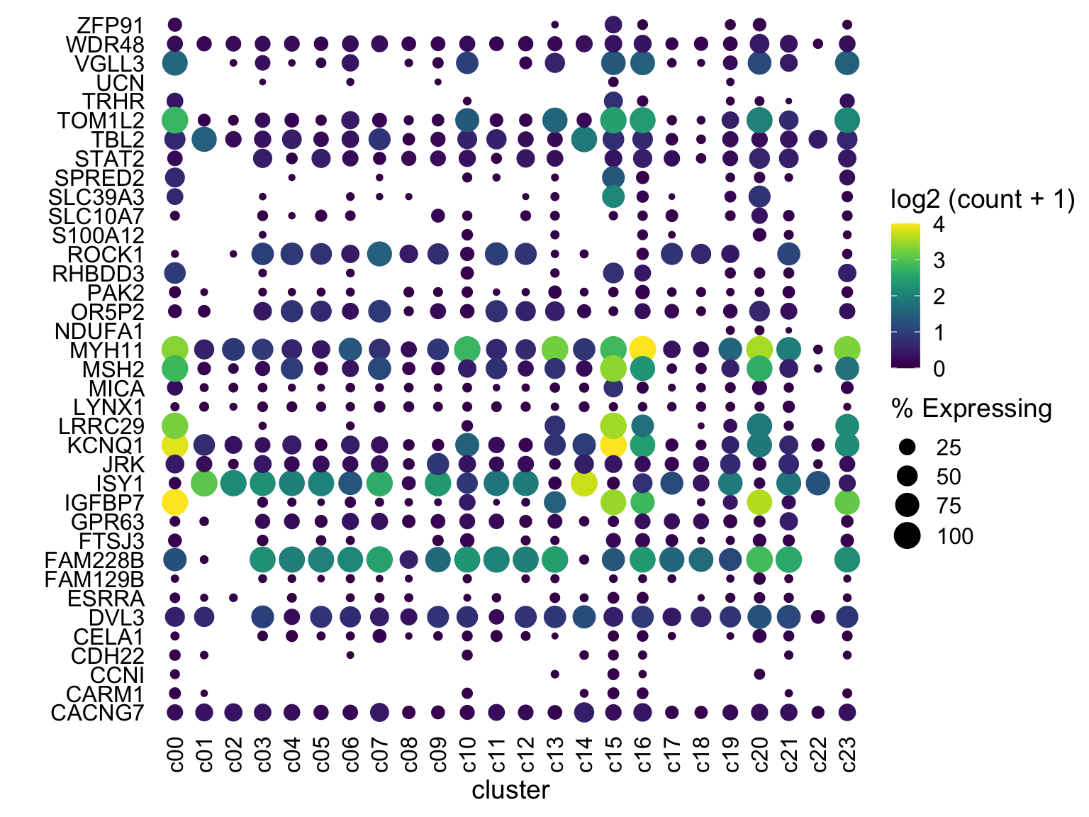
Now what?
Are we done? Well, this looks pretty good and for your data, this may be great!
But - in this case I’d like to group the genes (cluster) by similar expression patterns and show the dendrogram. This is trivial to do in a heatmap (e.g. my favorite ComplexHeatmap). See https://davemcg.github.io/post/simple-heatmaps-with-complexheatmaps/ for a guide I wrote.
But ggplot doesn’t have a built in dendrogram…so we will have to do some more work.
Some options:
- Just run
hclustand reorder the genes by the results withmutate(Gene = factor(Gene, levels = YOURNEWGENEORDER). This will visually (gene order) get the right result, but there’ll be no dendrogram. - Re-do this whole thing in
ComplexHeatmapand use the custom function cell_fun to hack something together. I used this once to add some text to a heatmap and it was painful enough that I would prefer not to go this route. - UPDATE: Ming Tang pointed out he wrote a blog post with another solution, ggtree written by Guangchuang Yu
- OLDER SOLUTION (see at the very end for the original solution)
Hey look: ggtree
Again (as of 2020-03-22), install from devtools like this: devtools::install_github("YuLab-SMU/ggtree")
# make data square to calculate euclidean distance
mat <- gene_cluster %>%
  filter(Gene %in% markers) %>%
  select(-cell_ct, -cell_exp_ct, -Group) %>%  # drop unused columns to faciliate widening
  pivot_wider(names_from = cluster, values_from = count) %>%
  data.frame() # make df as tibbles -> matrix annoying
row.names(mat) <- mat$Gene  # put gene in `row`
mat <- mat[,-1] #drop gene column as now in rows
clust <- hclust(dist(mat %>% as.matrix())) # hclust with distance matrix


ddgram <- as.dendrogram(clust) # create dendrogram
ggtree_plot <- ggtree::ggtree(ddgram)
ggtree_plot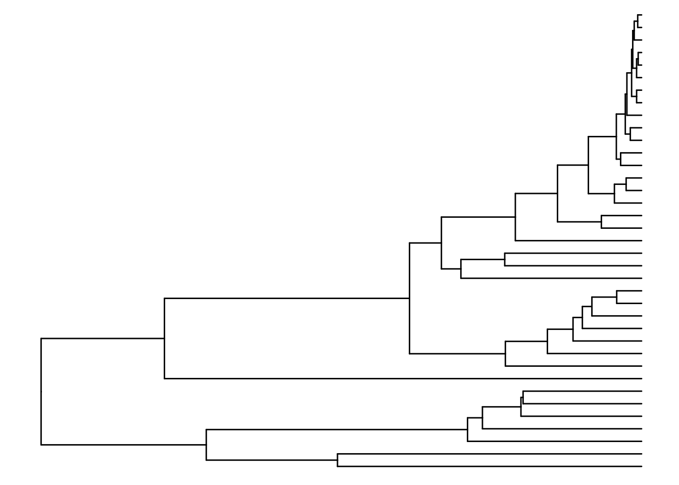
Let’s glue them together with cowplot
Notice how rel_widths in plot_grid is used to tweak the relative width of each plot and we are using align to attempt to line the plots up.
dotplot <- gene_cluster %>% filter(Gene %in% markers) %>%
mutate(`% Expressing` = (cell_exp_ct/cell_ct) * 100) %>%
filter(count > 0, `% Expressing` > 1) %>%
ggplot(aes(x=cluster, y = Gene, color = count, size = `% Expressing`)) +
geom_point() +
cowplot::theme_cowplot() +
theme(axis.line = element_blank()) +
theme(axis.text.x = element_text(angle = 90, vjust = 0.5, hjust=1)) +
ylab('') +
theme(axis.ticks = element_blank()) +
scale_color_gradientn(colours = viridis::viridis(20), limits = c(0,4), oob = scales::squish, name = 'log2 (count + 1)')
plot_grid(ggtree_plot, dotplot, nrow = 1, rel_widths = c(0.5,2), align = 'h')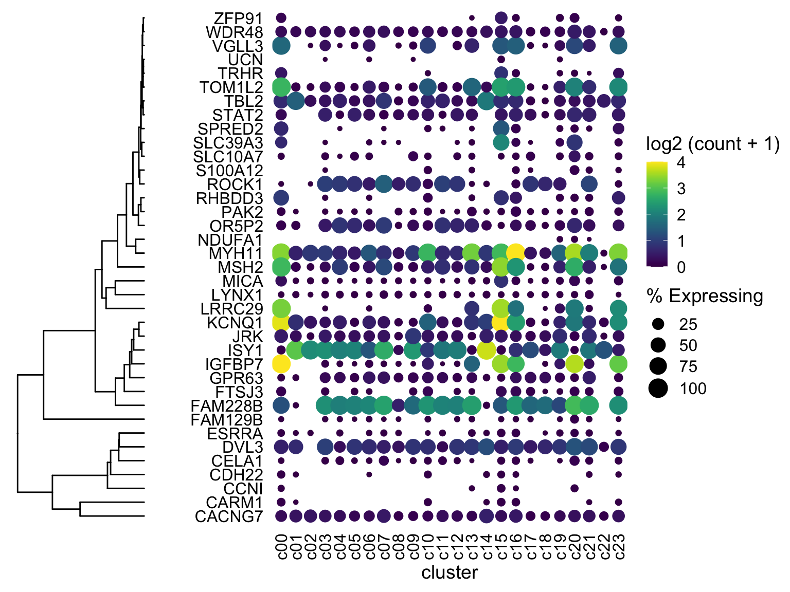 (ignore the fact that the genes are NOT reordered - I’ll get there. This was just to check if the dendrogram would line up with the genes….and it does! I’ll mention two more ways to fiddle with alignment if your own data does not line up)
How do we do better?
Two things:
- Reorder the genes with the hclust ordering.
- I’m also going to SQUEEZE the plots together with a cowplot trick of adding a fake plot in between and giving it a negative distance.
dotplot <- gene_cluster %>% filter(Gene %in% markers) %>%
  mutate(`% Expressing` = (cell_exp_ct/cell_ct) * 100,
         Gene = factor(Gene, levels = clust$labels[clust$order])) %>%
  #filter(count > 0, `% Expressing` > 1) %>%
  ggplot(aes(x=cluster, y = Gene, color = count, size = `% Expressing`)) +
  geom_point() +
  cowplot::theme_cowplot() +
  theme(axis.line  = element_blank()) +
  theme(axis.text.x = element_text(angle = 90, vjust = 0.5, hjust=1)) +
  ylab('') +
  theme(axis.ticks = element_blank()) +
  scale_color_gradientn(colours = viridis::viridis(20), limits = c(0,4), oob = scales::squish, name = 'log2 (count + 1)')

plot_grid(ggtree_plot, NULL, dotplot, nrow = 1, rel_widths = c(0.5,-0.05, 2), align = 'h')
Boom almost done!
Two more tweak options if you are having trouble:
- scale (cowplot)
- ylim2 (ggtree)
First thing to try if the two plots don’t line up: use ylim2 from ggtree to adjust the size of the ggplot object as follows:
ggtree_plot_yset <- ggtree_plot + ylim2(dotplot)## Scale for 'y' is already present. Adding another scale for 'y', which will
## replace the existing scale.plot_grid(ggtree_plot_yset, NULL, dotplot, nrow = 1, rel_widths = c(0.5,-0.05, 2), align = 'h')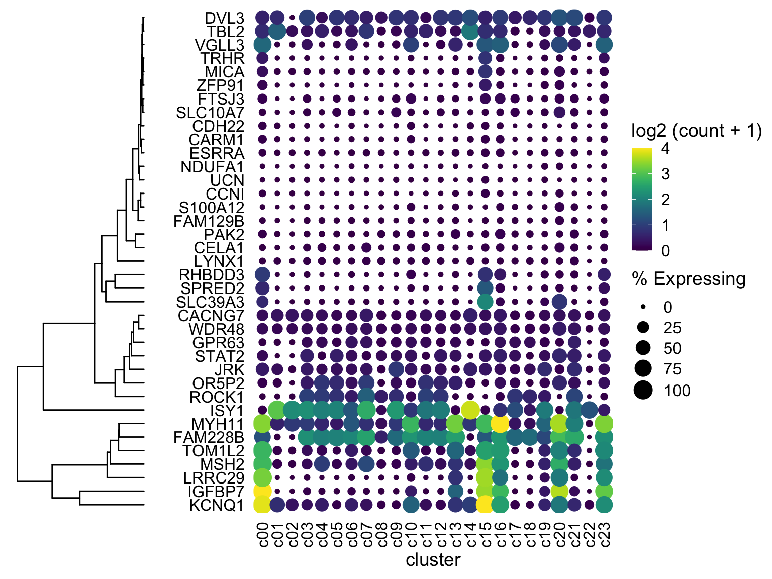 If you get an error about
 ylim2 not being available, then you have an older version of ggtree
The next option is to manually tweak size of each object with cowplot scale
One more adjust
Let’s move the gene names to the right side with scale_y_discrete(position = "right")
dotplot <- gene_cluster %>% filter(Gene %in% markers) %>%
  mutate(`% Expressing` = (cell_exp_ct/cell_ct) * 100,
         Gene = factor(Gene, levels = clust$labels[clust$order])) %>%
  filter(count > 0, `% Expressing` > 1) %>%
  ggplot(aes(x=cluster, y = Gene, color = count, size = `% Expressing`)) +
  geom_point() +
  cowplot::theme_cowplot() +
  theme(axis.line  = element_blank()) +
  theme(axis.text.x = element_text(angle = 90, vjust = 0.5, hjust=1)) +
  ylab('') +
  theme(axis.ticks = element_blank()) +
  scale_color_gradientn(colours = viridis::viridis(20), limits = c(0,4), oob = scales::squish, name = 'log2 (count + 1)') +
  scale_y_discrete(position = "right")
#################################################

plot_grid(ggtree_plot, NULL, dotplot, nrow = 1, rel_widths = c(0.5,-0.05, 2), align = 'h')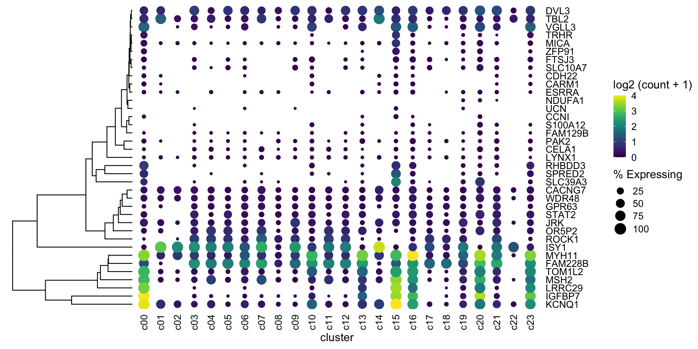
Moonshot
With our new (thanks Ming and Guangchuang) ggtree / ylim2 tools I’m wondering if I can get the clusters (columns) ordered by euclidean distance. Also I’m going to try to add some labels to the clusters.
# make data square to calculate euclidean distance
mat <- gene_cluster %>%
  filter(Gene %in% markers) %>%
  select(-cell_ct, -cell_exp_ct, -Group) %>%  # drop unused columns to faciliate widening
  pivot_wider(names_from = cluster, values_from = count) %>%
  data.frame() # make df as tibbles -> matrix annoying
row.names(mat) <- mat$Gene  # put gene in `row`
mat <- mat[,-1] #drop gene column as now in rows
v_clust <- hclust(dist(mat %>% as.matrix() %>% t())) # hclust with distance matrix
############ NOTICE THE t() above)

ddgram_col <- as.dendrogram(v_clust)
ggtree_plot_col <- ggtree(ddgram_col) + layout_dendrogram()

dotplot <- gene_cluster %>% filter(Gene %in% markers) %>%
  mutate(`% Expressing` = (cell_exp_ct/cell_ct) * 100,
         Gene = factor(Gene, levels = clust$labels[clust$order]),
         cluster = factor(cluster, levels = v_clust$labels[v_clust$order])) %>%
  filter(count > 0, `% Expressing` > 1) %>%
  ggplot(aes(x=cluster, y = Gene, color = count, size = `% Expressing`)) +
  geom_point() +
  cowplot::theme_cowplot() +
  theme(axis.line  = element_blank()) +
  theme(axis.text.x = element_text(angle = 90, vjust = 0.5, hjust=1)) +
  ylab('') +
  theme(axis.ticks = element_blank()) +
  scale_color_gradientn(colours = viridis::viridis(20), limits = c(0,4), oob = scales::squish, name = 'log2 (count + 1)') +
  scale_y_discrete(position = "right")
#################################################
ggtree_plot_col <- ggtree_plot_col + xlim2(dotplot)
## the plot was flipped and the x limits will be applied to y-axis## Scale for 'y' is already present. Adding another scale for 'y', which will
## replace the existing scale.ggtree_plot <- ggtree_plot + ylim2(dotplot)## Scale for 'y' is already present. Adding another scale for 'y', which will
## replace the existing scale.labels <- ggplot(gene_cluster %>%
mutate(`Cell Type` = Group,
cluster = factor(cluster, levels = v_clust$labels[v_clust$order])),
aes(x = cluster, y = 1, fill = `Cell Type`)) +
geom_tile() +
scale_fill_brewer(palette = 'Set1') +
theme_nothing() +
xlim2(dotplot)
legend <- plot_grid(get_legend(labels + theme(legend.position="bottom")))
plot_spacer() + plot_spacer() + ggtree_plot_col +
plot_spacer() + plot_spacer() + labels +
plot_spacer() + plot_spacer() + plot_spacer() +
ggtree_plot + plot_spacer() + dotplot +
plot_spacer() + plot_spacer() + legend +
plot_layout(ncol = 3, widths = c(0.7, -0.1, 4), heights = c(0.9, 0.1, -0.1, 4, 1))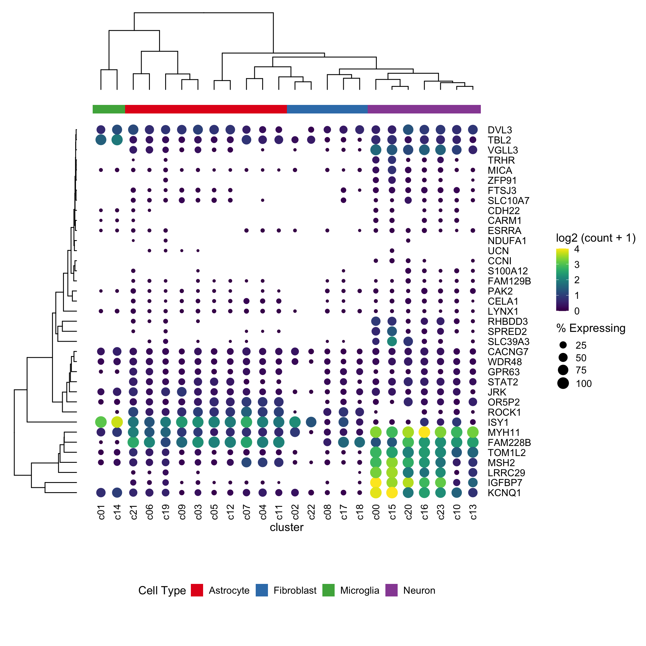
It works! I had to switch over to the patchwork package to layout the gg objects, as cowplot was being fiddly (as Guangchuang did in his example)
Downside
This has a LOT of moving parts. I’m not very confident this’ll work in 6 months (today is March 23rd 2020). But maybe I’m wrong?
Exercises for the reader
- Change the color scheme from
viridistomagma - Transform the plot to have clusters as rows and genes as columns
OLD Solution (kept for posterity)
Using ggdendro!
After some googling I discovered this faaaabulous stackoverflow post: https://stackoverflow.com/questions/42047896/joining-a-dendrogram-and-a-heatmap
I’ve largely copied and pasted chunks from it.
######################
# this is cribbed from
# https://stackoverflow.com/questions/42047896/joining-a-dendrogram-and-a-heatmap
# to align dendrogram with dotplot
ddata <- dendro_data(ddgram, type = 'rectangle') # extract into lists of data
gene_pos_table <- with(
  ddata$labels,
  data.frame(y_center = x, gene = as.character(label), height = 1))
# axis munging <- This is where the magic happens
gene_axis_limits <- with(
  gene_pos_table,
  c(min(y_center - 0.5 * height), max(y_center + 0.5 * height))) +  0.1 * c(-1, 1)

ddata <- with(
  segment(ddata),
  data.frame(x = y, y = x, xend = yend, yend = xend))

fancy_tree_plot <-  ggplot((ddata)) + geom_segment(aes(x = x, y = y, xend = xend, yend = yend)) +
  scale_x_reverse(expand = c(0, 0.5)) +
  scale_y_continuous(breaks = gene_pos_table$y_center,
                     labels = gene_pos_table$gene,
                     limits = gene_axis_limits,
                     expand = c(0, 0)) +
  labs(x = "Distance", y = "", colour = "", size = "") +
  theme_dendro()

dotplot <- gene_cluster %>% filter(Gene %in% markers) %>%
  mutate(`% Expressing` = (cell_exp_ct/cell_ct) * 100,
         Gene = factor(Gene, levels = gene_pos_table$gene)) %>%
  filter(count > 0, `% Expressing` > 1) %>%
  ggplot(aes(x=cluster, y = Gene, color = count, size = `% Expressing`)) +
  geom_point() +
  cowplot::theme_cowplot() +
  theme(axis.line  = element_blank()) +
  theme(axis.text.x = element_text(angle = 90, vjust = 0.5, hjust=1)) +
  ylab('') +
  theme(axis.ticks = element_blank()) +
  scale_color_gradientn(colours = viridis::viridis(20), limits = c(0,4), oob = scales::squish, name = 'log2 (count + 1)')
#################################################

plot_grid(fancy_tree_plot, NULL, dotplot, nrow = 1, rel_widths = c(0.5,-0.1, 2), align = 'h')