Intro
For this installment of Let’s Plot (where anyone can make a figure!), we’ll be making the hottest visualization of 2017 - the joy plot or ridgeline plot.
Joy plots are partially overlapping density line plots. They are useful for densely showing changes in many distributions over time / condition / etc.
This type of visualization was inspired by the cover art from Joy Division’s album Unknown Pleasures and implemented in the R package ggridges by Claus Wilke.

While the original term for this plot took off as joy plot it has since been changed to a ridgeline plot or ridges plots, as discussed at length here.
Anyways, Claus has a beautiful intro to his package here. I will not reproduce any of his plots, as I want you to click the link. Plus they are way cooler looking than what we will be making. Which is real(ish) data from people in my division.
Load Davide merged data
This is a highly cut down version of his original data - which is a 160mb csv file. The csv for this exercise can be found here.
It contains cell area size for thousands of cells which have had a drug perturbation, split by wells in a dish. One drug per well.
library(tidyverse)
library(ggridges)
merged.df <- read_csv('~/git/Let_us_plot/005_ggridges/davide_cell_size_data.csv')
What does the data look like?
head(merged.df)## # A tibble: 6 x 3
## Well.names Area Drug
## <chr> <int> <chr>
## 1 D07 643 20(S
## 2 D07 388 20(S
## 3 D09 290 20(S
## 4 D08 1174 20(S
## 5 D09 186 20(S
## 6 D09 7062 20(SFirst we create a fake DMSO to match each drug so we can see the ‘null’ distribution matched with each drug in the visualization below
I know for loops are out of trend, but I find them easier to write and read compared to purrr. A lot less compact, I concede.
This is a bit hacky, but I want to duplicate the DMSO data and assign it to each drug. Later we’ll be splitting the plot by drug, so we can see both the drug data and the DMSO data in the section.
# for background DMSO plot
fake_DMSO_drug <- data.frame()
for (i in (merged.df$Drug %>% unique())){
  print(i)
  fake_DMSO_drug <- rbind(fake_DMSO_drug, merged.df %>% filter(Drug=='DMSO') %>% mutate(Drug = i, Well.names=paste0('0DMSO_', i), DMSO='Yes'))
}
## [1] "20(S"
## [1] "3-Am"
## [1] "Brom"
## [1] "Cili"
## [1] "Ctrl"
## [1] "DMSO"
## [1] "ETP"
## [1] "G-Pr"
## [1] "GANT"
## [1] "HA 1"
## [1] "IMR-"
## [1] "IWP-"
## [1] "IWR-"
## [1] "LGK-"
## [1] "LY41"
## [1] "Metf"
## [1] "PJ 3"
## [1] "SANT"
## [1] "Sodi"
## [1] "Tori"
## [1] "UNC"
## [1] "Valp"
## [1] "Wnt-"
## [1] "WYE"# order drugs by median area
drug_order <- merged.df %>% group_by(Drug) %>% summarise(MedianArea=median(Area)) %>% arrange(MedianArea) %>% pull(Drug)ridgeline plot, showing each well separately
Several wells got the same drugs. So there are multiple plots per drug.
bind_rows(merged.df %>% mutate(DMSO='No'),fake_DMSO_drug) %>%
  filter(Drug!='DMSO', Drug!='Pyr') %>% # don't need DMSO plot now and Pyr is empty
  mutate(Drug=factor(Drug, levels=drug_order)) %>% # reorder drugs by drug_order above
  ggplot(aes(y = Drug, x=log2(Area), group=Well.names, fill=DMSO)) +
  geom_density_ridges(alpha=0.6) +
  theme_ridges() +
  scale_fill_brewer(palette = 'Set1')
## Picking joint bandwidth of 0.258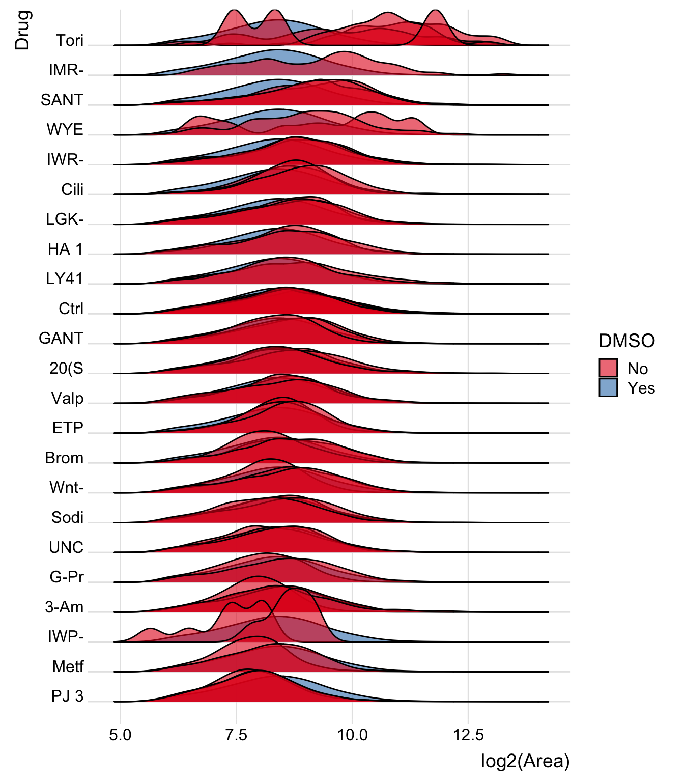
Same, but merging all wells together
Now merge all the wells together. Notice how the group is now Well.names2
bind_rows(merged.df %>%
            mutate(DMSO='No', Well.names2=paste0('Orig', Drug)),
          fake_DMSO_drug %>%
            mutate(Well.names2 = Well.names)) %>%
  filter(Drug!='DMSO', Drug!='Pyro') %>% # dont' need DMSO plot now and Pyroxamine is empty
  mutate(Drug=factor(Drug, levels=drug_order)) %>% # reorder drugs by drug_order above
  ggplot(aes(y = Drug, x = log2(Area), group=Well.names2, fill=DMSO)) +
  geom_density_ridges(alpha=0.6) +
  theme_ridges() +
  scale_fill_brewer(palette = 'Set1')
## Picking joint bandwidth of 0.204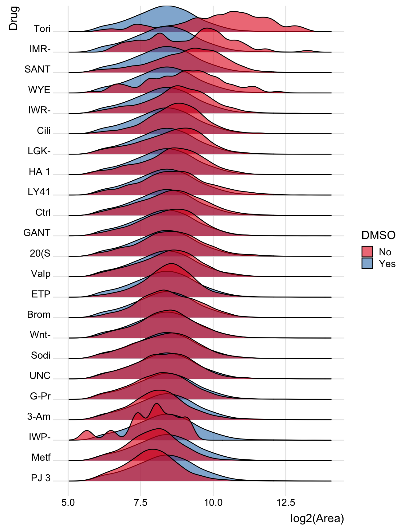
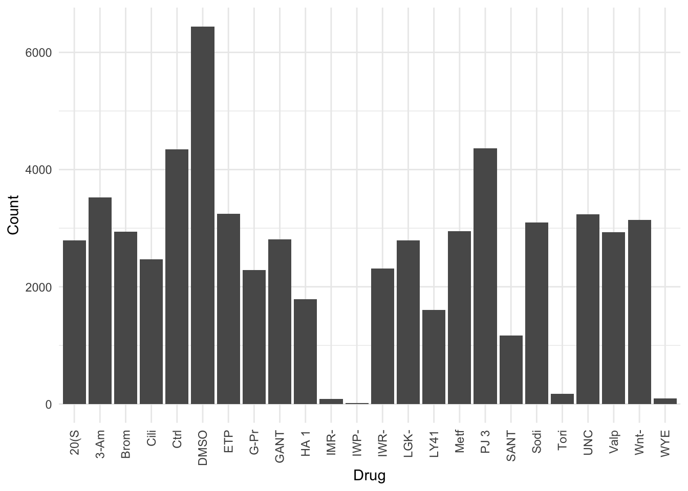
There’s a large variation in the number of counts
How did I know? Because a bunch of the density plots were super wavy - which means (almost always) that the number of counts in that sample is very low. Low numbers = high variance.
So IMR, IMP, Tori, and WYE are problem tests. Perhaps they are just killing the cells? Something for Davide to examine.
cell_area_counts_by_drug <- merged.df %>%
  group_by(Drug) %>%
  summarise(Count=n())

cell_area_counts_by_drug  %>%
  ggplot(aes(x=Drug, y=Count)) +
  geom_bar(stat='identity') +
  theme_minimal() +
  theme(axis.text.x = element_text(angle = 90, vjust = 0.5, hjust=1))