Intro
This is the 9th Let’s Plot…and I’ve not done a workup of the most useful plot - the boxplot. Oops. Well let’s rectify that.
Load packages
Many many packages. We’ll see what they do later.
If you get an error loading the packge, you can install it by running install.packages as:
install.package('dabestr')
library(dabestr)## Warning: package 'dabestr' was built under R version 3.6.2## Loading required package: magrittrlibrary(readr)
library(dplyr)## Warning: package 'dplyr' was built under R version 3.6.2##
## Attaching package: 'dplyr'## The following objects are masked from 'package:stats':
##
## filter, lag## The following objects are masked from 'package:base':
##
## intersect, setdiff, setequal, unionlibrary(ggplot2)## Warning: package 'ggplot2' was built under R version 3.6.2library(ggpubr)## Warning: package 'ggpubr' was built under R version 3.6.2library(ggbeeswarm)
library(cowplot)##
## Attaching package: 'cowplot'## The following object is masked from 'package:ggpubr':
##
## get_legend## The following object is masked from 'package:ggplot2':
##
## ggsaveImport TSV (tab-separated-value) file
Quick peek into the import. This data is from Figure 2a from the Bharti lab’s paper Clinical-grade stem cell–derived retinal pigment epithelium patch rescues retinal degeneration in rodents and pigs
fig2a_data <- read_tsv('https://github.com/davemcg/davemcg.github.io/raw/master/content/post/fig2.tsv')## Parsed with column specification:
## cols(
## `Single layer unfused` = col_character(),
## `287.57` = col_double()
## )fig2a_data## # A tibble: 28 x 2
## `Single layer unfused` `287.57`
## <chr> <dbl>
## 1 Single layer unfused 302.
## 2 Single layer unfused 248.
## 3 Single layer unfused 296.
## 4 Single layer unfused 307.
## 5 Single layer unfused 179.
## 6 Single layer unfused 453.
## 7 Single layer unfused 143.
## 8 Single layer unfused 189.
## 9 Single layer unfused 239
## 10 Single layer unfused 327.
## # … with 18 more rowsThis doesn’t look right…there’s no header in this data. Let’s re-import.
fig2a_data <- read_tsv('https://github.com/davemcg/davemcg.github.io/raw/master/content/post/fig2.tsv', col_names = FALSE)## Parsed with column specification:
## cols(
## X1 = col_character(),
## X2 = col_double()
## )fig2a_data## # A tibble: 29 x 2
## X1 X2
## <chr> <dbl>
## 1 Single layer unfused 288.
## 2 Single layer unfused 302.
## 3 Single layer unfused 248.
## 4 Single layer unfused 296.
## 5 Single layer unfused 307.
## 6 Single layer unfused 179.
## 7 Single layer unfused 453.
## 8 Single layer unfused 143.
## 9 Single layer unfused 189.
## 10 Single layer unfused 239
## # … with 19 more rowsBetter. Let’s add some column names
colnames(fig2a_data) <- c('Scaffold', 'Young\'s Modulus')
fig2a_data
## # A tibble: 29 x 2
## Scaffold `Young's Modulus`
## <chr> <dbl>
## 1 Single layer unfused 288.
## 2 Single layer unfused 302.
## 3 Single layer unfused 248.
## 4 Single layer unfused 296.
## 5 Single layer unfused 307.
## 6 Single layer unfused 179.
## 7 Single layer unfused 453.
## 8 Single layer unfused 143.
## 9 Single layer unfused 189.
## 10 Single layer unfused 239
## # … with 19 more rowsOK, let’s see how many Scaffold types we have and the number of samples of each with base R style.
table(fig2a_data$Scaffold )##
## Bilayer aligned fibers Bilayer random fibers Single layer fused
## 5 3 6
## Single layer unfused
## 15Now let’s do the same, but in a tidyverse way. We us the %>% to pipe the fig2a_data into group_by then the grouped data is sent to summarise to do the counting (with n()). It’s more readable this way.
fig2a_data %>% group_by(Scaffold) %>% summarise(Count = n())## `summarise()` ungrouping output (override with `.groups` argument)## # A tibble: 4 x 2
## Scaffold Count
## <chr> <int>
## 1 Bilayer aligned fibers 5
## 2 Bilayer random fibers 3
## 3 Single layer fused 6
## 4 Single layer unfused 15Plotting!
OK. Let’s do a quick boxplot.
fig2a_data %>%
  ggplot(aes(x=Scaffold, y=`Young\'s Modulus`)) +
  geom_boxplot()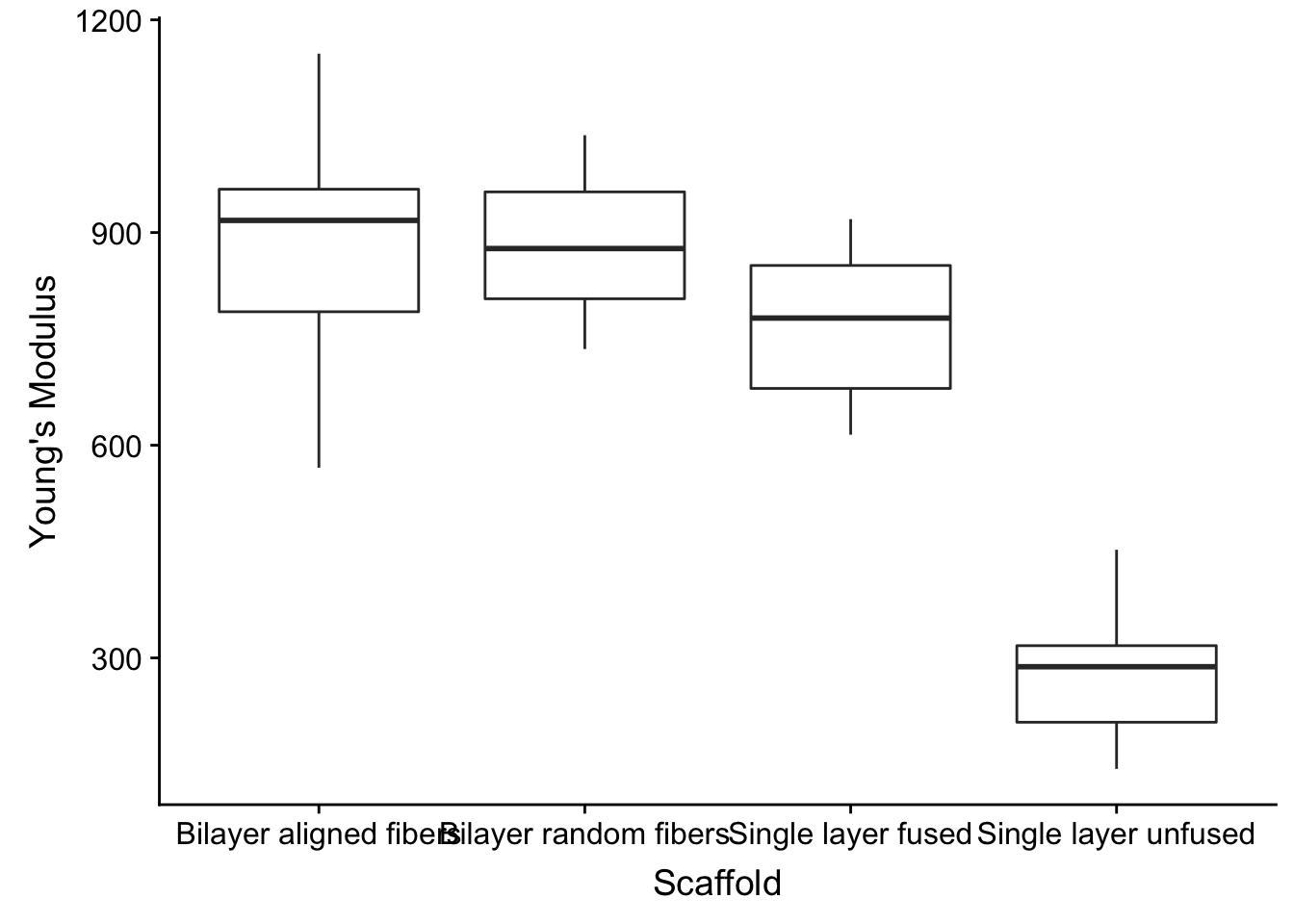
Hmm, the order is not ideal
Let’s convert the Scaffold character vector type column into a factor, which allows us to set a custom order of the values. ggplot uses alphabetical order for character vectors.
fig2a_data %>%
  mutate(Scaffold = factor(Scaffold, levels = c('Single layer unfused', 'Single layer fused', 'Bilayer random fibers', 'Bilayer aligned fibers'))) %>%
  ggplot(aes(x=Scaffold, y=`Young\'s Modulus`)) +
  geom_boxplot()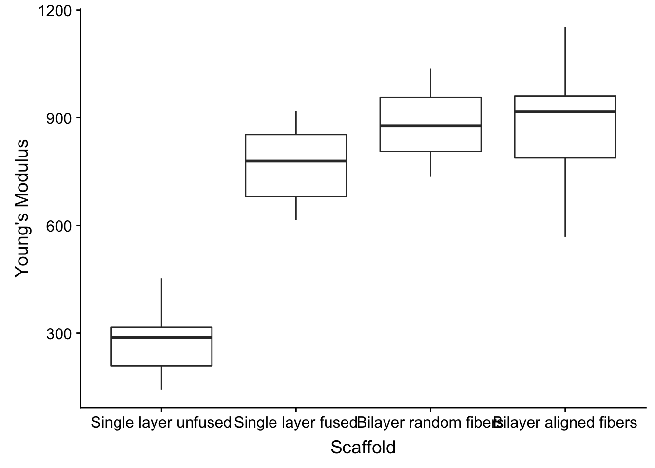
Overlay points
I am a HUGE proponent of showing your data. If you just use the boxplot you are not giving any information on how many experiments you have done.
So let’s show off the data by using the the modular nature of ggplot
Need another plotting style? Just + another geom_
fig2a_data %>%
  mutate(Scaffold = factor(Scaffold, levels = c('Single layer unfused', 'Single layer fused', 'Bilayer random fibers', 'Bilayer aligned fibers'))) %>%
  ggplot(aes(x=Scaffold, y=`Young\'s Modulus`)) +
  geom_boxplot() +
  geom_point()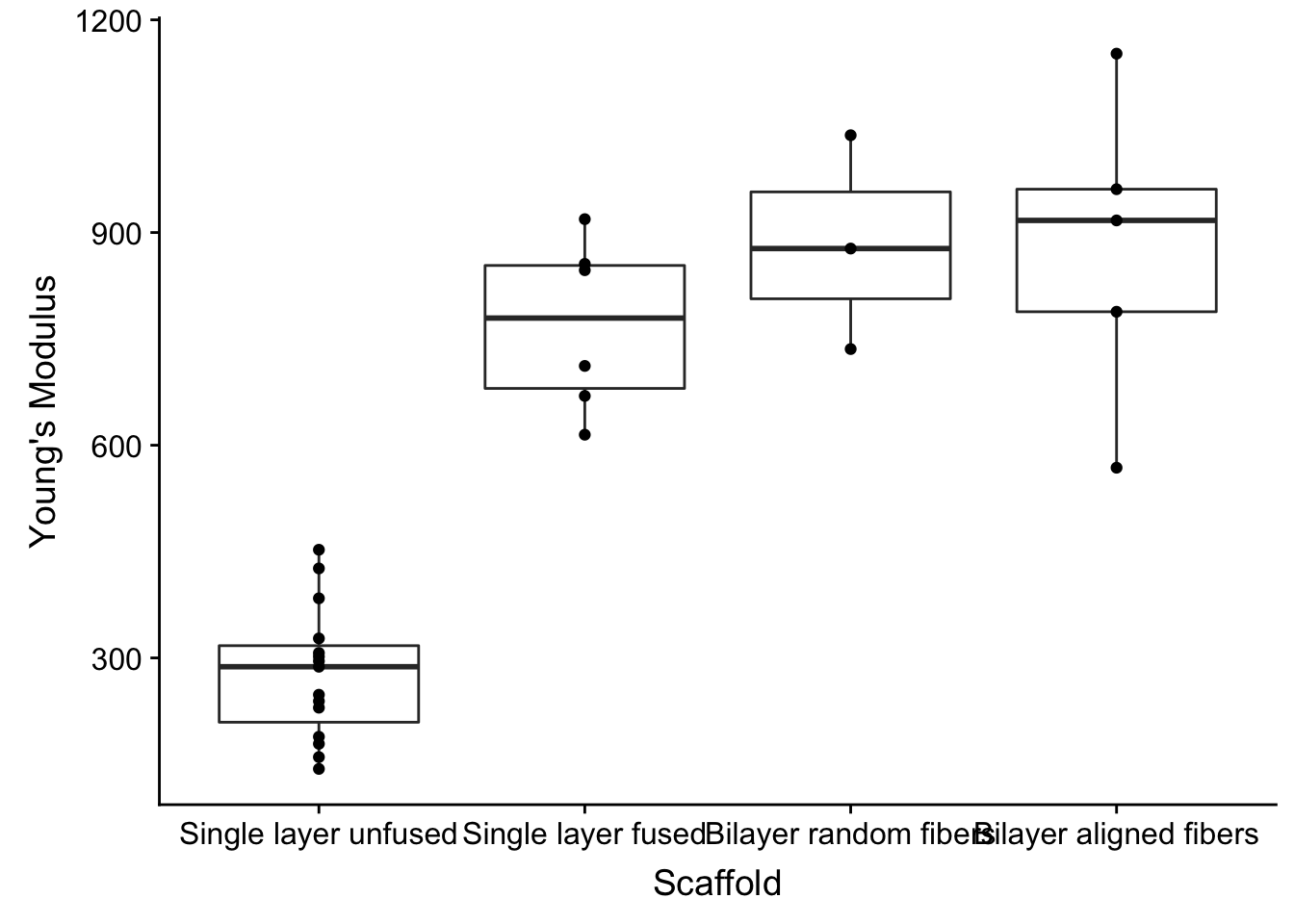
Wilcox test
It’s popular in science papers to show the p-values between the groups. We set up the groupings with the my_comparison list object. ggpubr then is used to overlay the results with its stat_compare_means ggplot add-on.
my_comparisons <- list( c("Single layer unfused", "Single layer fused"), c("Single layer unfused", "Bilayer random fibers"), c("Single layer unfused", "Bilayer aligned fibers") )
fig2a_data %>%
  mutate(Scaffold = factor(Scaffold, levels = c('Single layer unfused', 'Single layer fused', 'Bilayer random fibers', 'Bilayer aligned fibers'))) %>%
  ggplot(aes(x=Scaffold, y=`Young\'s Modulus`)) +
  geom_boxplot() +
  geom_point() +
  stat_compare_means(comparisons = my_comparisons, method = 'wilcox.test')
ggbeeswarm
When you have many points, they tend to overlap each other. A beeswarm plot is nice because it spreads the points sideways in a manner to show the distribution of the data.
I’ve replaced geom_point with geom_quasirandom.
my_comparisons <- list( c("Single layer unfused", "Single layer fused"), c("Single layer unfused", "Bilayer random fibers"), c("Single layer unfused", "Bilayer aligned fibers") )
fig2a_data %>%
  mutate(Scaffold = factor(Scaffold, levels = c('Single layer unfused', 'Single layer fused', 'Bilayer random fibers', 'Bilayer aligned fibers'))) %>%
  ggplot(aes(x=Scaffold, y=`Young\'s Modulus`)) +
  geom_boxplot() +
  geom_quasirandom() +
stat_compare_means(comparisons = my_comparisons, method = 'wilcox.test') 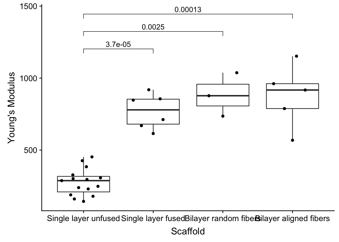
Themes
I’m not partial to gray everwhere, so let’s use the cowplot theme_cowplot theme.
my_comparisons <- list( c("Single layer unfused", "Single layer fused"), c("Single layer unfused", "Bilayer random fibers"), c("Single layer unfused", "Bilayer aligned fibers") )
fig2a_data %>%
  mutate(Scaffold = factor(Scaffold, levels = c('Single layer unfused', 'Single layer fused', 'Bilayer random fibers', 'Bilayer aligned fibers'))) %>%
  ggplot(aes(x=Scaffold, y=`Young\'s Modulus`)) +
  geom_boxplot() +
  geom_quasirandom() +
  stat_compare_means(comparisons = my_comparisons, method = 'wilcox.test') +
theme_cowplot() 
Themes, with some tweaking of color and text
- Increase point size
- Make boxplot black
- Make points gray
- Make scaffold labels less wide by adding
\n(newline) between each word
my_comparisons <- list( c("Single\nlayer\nunfused", "Single\nlayer\nfused"), c("Single\nlayer\nunfused", "Bilayer\nrandom\nfibers"), c("Single\nlayer\nunfused", "Bilayer\naligned\nfibers") )
fig2a_data %>%
  mutate(Scaffold = gsub(' ', '\n', Scaffold),
         Scaffold = factor(Scaffold, levels = c('Single\nlayer\nunfused', 'Single\nlayer\nfused', 'Bilayer\nrandom\nfibers', 'Bilayer\naligned\nfibers'))) %>%
  ggplot(aes(x=Scaffold, y=`Young\'s Modulus`)) +
  geom_boxplot(fill = 'black', color = 'dimgray') +
  geom_quasirandom(color = 'dimgray', size = 3) +
  stat_compare_means(comparisons = my_comparisons, method = 'wilcox.test') +
theme_cowplot() 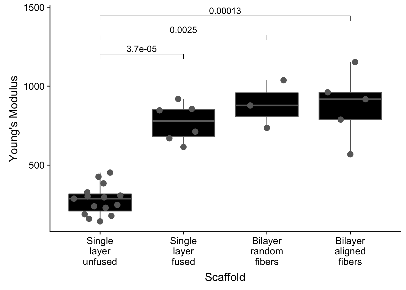
dabest, one comparison
One visualization that has been discussed as an alternative to the boxplot is the estimation plot. As R is a super popular figure making platform, the authors have made an R package to make these plots.
dabest_dat <- fig2a_data %>%
  filter(Scaffold %in% c("Single layer unfused", "Single layer fused"))
dabest(dabest_dat, x= Scaffold, y = `Young\'s Modulus`,
                             idx = c("Single layer unfused", "Single layer fused"),
                             paired = FALSE) %>%
                      mean_diff() %>%
  plot(effsize.ylim = c(0, 1000))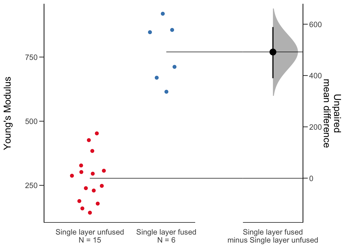
dabest, multiple comparisons
dabest(fig2a_data, x= Scaffold, y = `Young\'s Modulus`,
                             idx = c("Single layer unfused", "Single layer fused", "Bilayer random fibers","Bilayer aligned fibers"),
                             paired = FALSE) %>%
                      mean_diff() %>%
  plot(effsize.ylim = c(0, 1000))
## Warning in plot.dabest_effsize(., effsize.ylim = c(0, 1000)): NAs
## introduced by coercion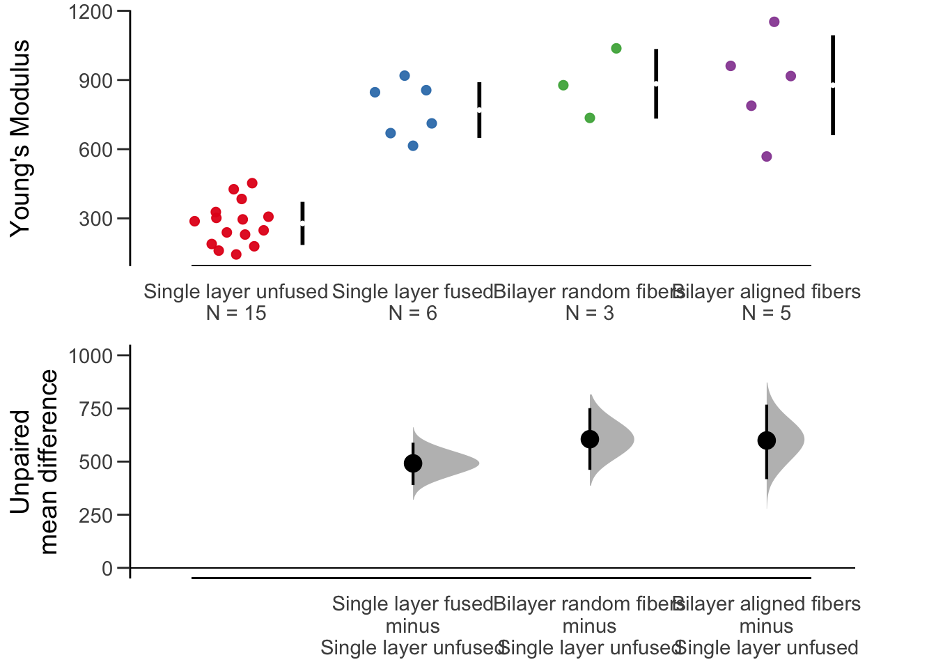
Conclusion
Boxplots are easy, making them look awesome is more work. But R and ggplot2 are up to it.
Session Info
Version numbers of things
sessionInfo()## R version 3.6.0 (2019-04-26)
## Platform: x86_64-apple-darwin15.6.0 (64-bit)
## Running under: macOS 10.15.6
##
## Matrix products: default
## BLAS: /Library/Frameworks/R.framework/Versions/3.6/Resources/lib/libRblas.0.dylib
## LAPACK: /Library/Frameworks/R.framework/Versions/3.6/Resources/lib/libRlapack.dylib
##
## locale:
## [1] en_US.UTF-8/en_US.UTF-8/en_US.UTF-8/C/en_US.UTF-8/en_US.UTF-8
##
## attached base packages:
## [1] stats graphics grDevices utils datasets methods base
##
## other attached packages:
## [1] cowplot_0.9.4 ggbeeswarm_0.6.0 ggpubr_0.4.0 ggplot2_3.3.2
## [5] dplyr_1.0.0 readr_1.3.1 dabestr_0.3.0 magrittr_1.5
##
## loaded via a namespace (and not attached):
## [1] beeswarm_0.2.3 tidyselect_1.1.0 xfun_0.7
## [4] purrr_0.3.2 haven_2.1.0 carData_3.0-4
## [7] colorspace_1.4-1 vctrs_0.3.2 generics_0.0.2
## [10] htmltools_0.3.6 yaml_2.2.0 utf8_1.1.4
## [13] rlang_0.4.7 pillar_1.4.6 foreign_0.8-71
## [16] glue_1.4.1 withr_2.1.2 RColorBrewer_1.1-2
## [19] readxl_1.3.1 plyr_1.8.4 lifecycle_0.2.0
## [22] stringr_1.4.0 munsell_0.5.0 ggsignif_0.6.0
## [25] blogdown_0.13 gtable_0.3.0 cellranger_1.1.0
## [28] zip_2.0.2 evaluate_0.13 labeling_0.3
## [31] knitr_1.23 rio_0.5.16 forcats_0.4.0
## [34] vipor_0.4.5 curl_3.3 fansi_0.4.0
## [37] broom_0.7.0 Rcpp_1.0.5 scales_1.0.0
## [40] backports_1.1.4 abind_1.4-5 hms_0.4.2
## [43] digest_0.6.19 stringi_1.4.3 openxlsx_4.1.5
## [46] bookdown_0.11 rstatix_0.6.0 grid_3.6.0
## [49] cli_1.1.0 tools_3.6.0 tibble_3.0.3
## [52] crayon_1.3.4 tidyr_1.1.0 car_3.0-8
## [55] pkgconfig_2.0.2 ellipsis_0.3.1 data.table_1.12.2
## [58] assertthat_0.2.1 rmarkdown_1.13 R6_2.4.0
## [61] boot_1.3-22 compiler_3.6.0