tldr
Area Under the Curve (AUC) of Receiver Operating Characteristic (ROC) is a terrible metric for a genomics problem. Do not use it. This metric also goes by AUC or AUROC. Use Precision Recall AUC.
Inspiration for this post
- I am working on a machine learning problem in genomics
- I was getting really confused why AUROC was so worthless
- scienceTwitter featuring Anshul Kundaje
- I want to save you (some time)
What’s a ROC?
First, you do have to use them because everyone uses them and expects them, but try to move them in the supplementary figures. Eventually the field will stop expecting this and demand to see a useful metric - like AUC of Precision Recall. More on this later.
Before we discuss how an ROC is constructed, let’s see first see a Confusion Matrix of a model.
| Reference | |||
| Positive | Negative | ||
| Prediction | Positive | 236 | 103 |
| Negative | 174 | 116,952 |
The two axes of a ROC are:
- True Positive Rate (TPR) / Sensitivity / Recall (I assume it goes by so many names because different fields kept re-inventing it)
- False Positive Rate (FPR)
The TPR of the model is: \[\frac{236}{236 + 174}\approx0.576\]
The FPR of the model is: \[\frac{103}{103 + 116,952}\approx0.001\]
The model does not actually spit out positive or negative. It gives out probabilities that a given item is positive or negative. If we change the probabilities cutoff to different values (to make the classification more or less stringent) we can get different TPR and FPR. This is done to generate TPR and FPR from 0 to 1 and a line is plotted. The AUC for the ROC (AUROC) is then calculated by measuring the area under the curve. Either by taking the integral or a trapezoidal approximation.
A larger AUROC is better. 1 is perfect. 0.5 is a bunch of grad students flipping coins.
Now we have a rough idea of ROC works. Now let’s do some machine learning and see ROC works in practice.
Machine Learning
Load data. Briefly, they are ClinVar variants for a variety of eye disease. They’ve been classified as Pathogenic or NotPathogenic by groups submitting to ClinVar (ClinVar uses the term benign). Each variant has been labeled with a variety of pathogenicity scores, population frequency info, and in silico consequences. Empty values were assigned -1 (brief aside: I’m not sure if imputing missing data is a good idea here). One hot encoding was done to turn categorical information into numeric vectors. Each predictor (column) was centered and scaled.
You can download the clinvar_one_hot_CS_toy_set.tsv.gz file here
library(tidyverse)## ── Attaching packages ────────────────────────────────────────────────────────────────────────────────────────────────────────────────────────────────────────────── tidyverse 1.2.1 ──## ✔ ggplot2 3.0.0 ✔ purrr 0.2.4
## ✔ tibble 1.4.2 ✔ dplyr 0.7.6
## ✔ tidyr 0.8.1 ✔ stringr 1.3.1
## ✔ readr 1.1.1 ✔ forcats 0.3.0## ── Conflicts ───────────────────────────────────────────────────────────────────────────────────────────────────────────────────────────────────────────────── tidyverse_conflicts() ──
## ✖ dplyr::filter() masks stats::filter()
## ✖ dplyr::lag() masks stats::lag()clinvar <- read_tsv('~/git/eye_var_Pathogenicity/processed_data/clinvar_one_hot_CS_toy_set.tsv.gz')## Parsed with column specification:
## cols(
## Status = col_character(),
## is_lof = col_double(),
## impact_severity = col_double(),
## polyphen_score = col_double(),
## sift_score = col_double(),
## revel = col_double(),
## cadd_phred = col_double(),
## af_exac_all = col_double(),
## pli = col_double(),
## n_syn = col_double(),
## n_mis = col_double(),
## precessive = col_double(),
## fathmm_mkl_coding_score = col_double()
## )# set levels for status
clinvar $Status <- factor(clinvar$Status, levels=c('Pathogenic','NotPathogenic'))Quickly check our data
Status is the crucial column - it has the answer key
clinvar$Status %>% table()## .
## Pathogenic NotPathogenic
## 186 8246Predictors
clinvar %>% select(-Status) %>% colnames()## [1] "is_lof" "impact_severity"
## [3] "polyphen_score" "sift_score"
## [5] "revel" "cadd_phred"
## [7] "af_exac_all" "pli"
## [9] "n_syn" "n_mis"
## [11] "precessive" "fathmm_mkl_coding_score"Split data into training and testing sets
clinvar$index <- seq(1:nrow(clinvar))
set.seed(9253)
train_set <- clinvar %>% group_by(Status) %>% sample_frac(0.5)
test_set <- clinvar %>% filter(!index %in% train_set$index)
# remove index so the models don't use them to classify
train_set <- train_set %>% select(-index)
test_set <- test_set %>% select(-index)
Set up training paramters
This is a nice feature of the caret package. You can customize training parameters and apply them to multiple algorithms
library(caret)## Loading required package: lattice##
## Attaching package: 'caret'## The following object is masked from 'package:purrr':
##
## lift# 5 fold cross validation
# twoClassSummary optimizes the algorithm for AUROC
fitControl_naive <- trainControl(
classProbs=T, # we want probabilites returned for each prediction
method = "cv",
number = 5,
summaryFunction = twoClassSummary
)Build models
This is the big lie of machine learning. Look how trivial this is! Never mind the difficulty of all the work summarized above…
bglmFit <- train(Status ~ ., data=train_set,
                 method = 'bayesglm',
                 trControl = fitControl_naive)
rfFit <- train(Status ~ ., data=train_set,
               method = 'rf',
                 trControl = fitControl_naive)
# let's see how a popular pathogenicity score does alone
caddFit <- train(Status ~ ., data=train_set %>% select(Status, cadd_phred),
                   method = 'glm',
                 trControl = fitControl_naive)


my_models <- list()
my_models$bglm <- bglmFit
my_models$rfFit <- rfFit
my_models$cadd <- caddFit
AUROC Plot!
library(PRROC)
# AUROC
roc_maker <- function(model, data) {
# new predictions on test set
# don't use the training set - if you are overfitting you will not get accurate idea of your models merit
new_predictions <- predict(model, data, type = 'prob') %>%
mutate(Answers = data$Status,
Prediction = case_when(Pathogenic > 0.5 ~ 'Pathogenic',
TRUE ~ 'NotPathogenic'))
roc.curve(scores.class0 = new_predictions %>% filter(Answers=='Pathogenic') %>% pull(Pathogenic),
scores.class1 = new_predictions %>% filter(Answers=='NotPathogenic') %>% pull(Pathogenic),
curve = T)
}
#bglm
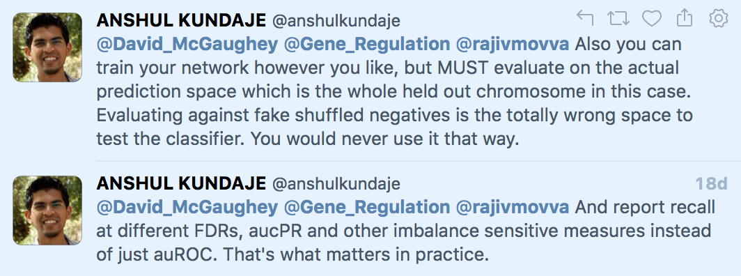
plot(roc_maker(bglmFit, test_set))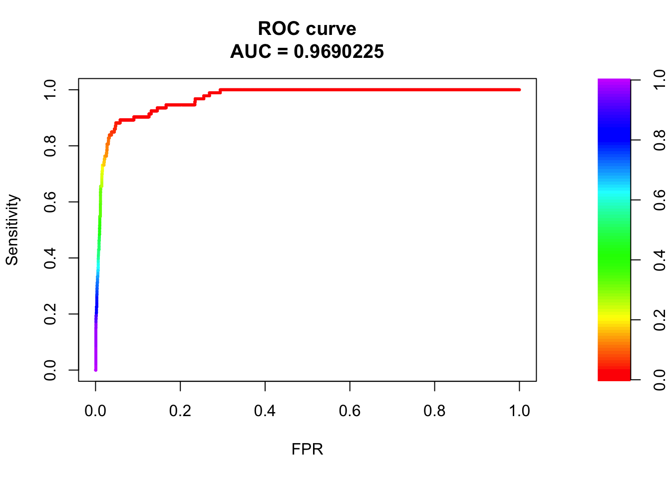 Wow! 97% AUC for a bayesian generalized linear model for predicting pathogenicity! Let’s go straight to Nature/Cell/PNAS/Science!
Well, let’s plot all three predictors at once. I did make three models after all.
roc_data <- data.frame()
for (i in names(my_models)){
  print(my_models[[i]]$method)
  roc <- roc_maker(my_models[[i]], test_set)
  out <- roc$curve[,1:2] %>% data.frame()
  colnames(out) <- c('FPR','Sensitivity')
  out$model <- i
  out$AUC <- roc$auc
  out$'Model (AUC)' <- paste0(i, ' (',round(roc$auc, 2),')' )
  roc_data <- rbind(roc_data, out)
}
## [1] "bayesglm"
## [1] "rf"
## [1] "glm"roc <- roc_data %>%
ggplot(aes(x=FPR, y=Sensitivity, colour=`Model (AUC)`)) +
geom_line() +
theme_minimal() +
ggtitle('AUROC') +
ggsci::scale_color_startrek()
roc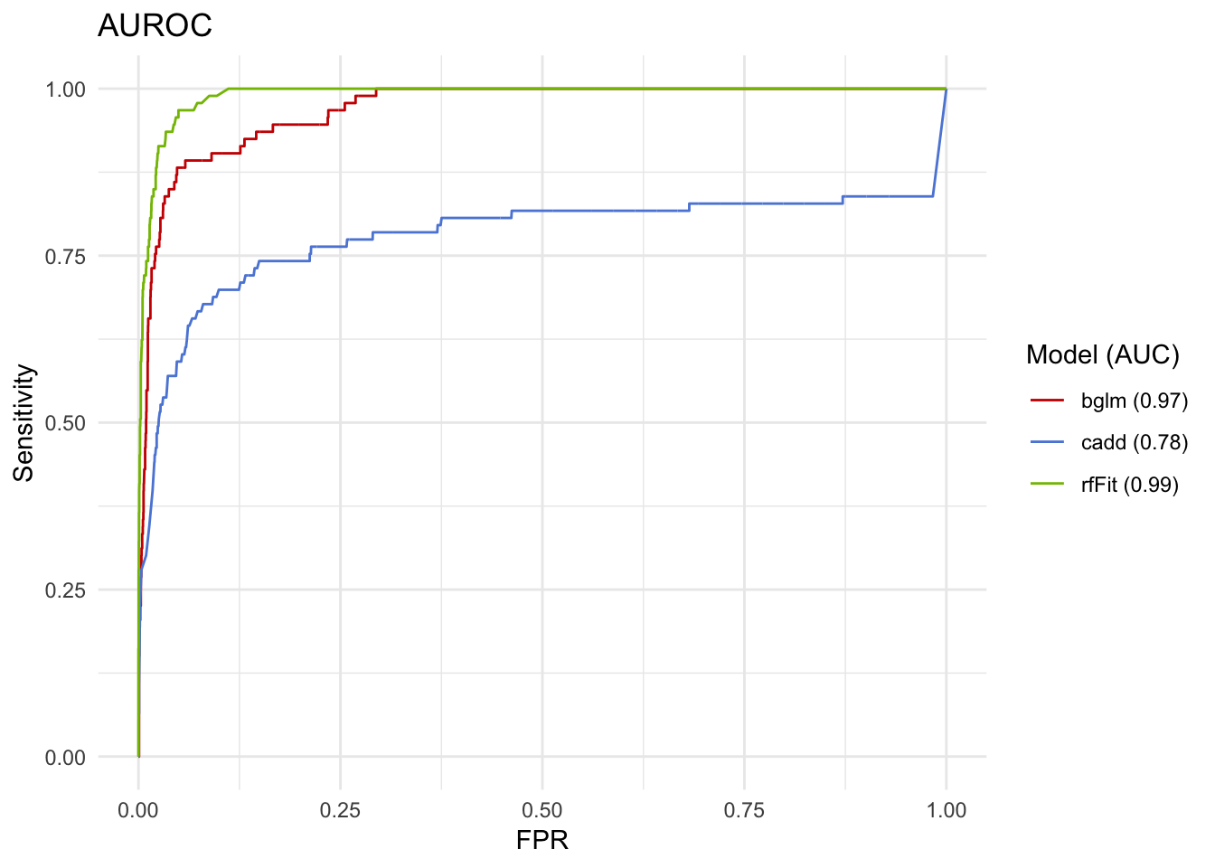
Wow, the random forests are even better! CADD alone isn’t so bad, either! 78% is almost a B, right?
Well, maybe we should make those confusion matrix things I showed earlier. Just to be careful.
cm_maker <- function(model, data, cutoff=0.5, mode = 'sens_spec') {
  new_predictions <- predict(model, data, type='prob') %>%
    mutate(Answers = as.factor(data$Status), Prediction = as.factor(case_when(Pathogenic > cutoff ~ 'Pathogenic', TRUE ~ 'NotPathogenic')))
  confusionMatrix(data = new_predictions$Prediction, reference = as.factor(new_predictions$Answers), mode= mode)
}

for (i in names(my_models)){
  print(i)
  print(cm_maker(my_models[[i]], test_set)$table)
}
## [1] "bglm"
## Reference
## Prediction Pathogenic NotPathogenic
## Pathogenic 43 35
## NotPathogenic 50 4088
## [1] "rfFit"
## Reference
## Prediction Pathogenic NotPathogenic
## Pathogenic 58 18
## NotPathogenic 35 4105
## [1] "cadd"
## Reference
## Prediction Pathogenic NotPathogenic
## Pathogenic 10 3
## NotPathogenic 83 4120Huh, these do not look so great….the TPR for the bayes glm model is only 46%. But the AUROC looked so awesome.
What is happening?
Well, the classes are imbalanced. ROC plots are designed to provide useful information when your classes are balanced. You have a huge set of NotPathogenic compared to Pathogenic. We have 186 Pathogenic and 8246 NotPathogenic.
A model that always guessed NotPathogenic would also do great on the AUROC.
How do we better represent reality?
Precision Recall Plots
These plot precision against recall. The advantage compared to ROC is that they do not take into the negative class. Let’s see what they look like with the same models. One thing to quickly note is that, by convention, the plots are ‘mirrored’ compared to ROC - you want your model to be in the top right for a PR plot, instead of the top left for a ROC.
# precision recall AUC
pr_maker <- function(model, data) {
  new_predictions <- predict(model, data, type = 'prob') %>%
    mutate(Answers = data$Status, Prediction = case_when(Pathogenic > 0.5 ~ 'Pathogenic', TRUE ~ 'NotPathogenic'))
  pr.curve(scores.class0 = new_predictions %>% filter(Answers=='Pathogenic') %>% pull(Pathogenic),
           scores.class1 = new_predictions %>% filter(Answers=='NotPathogenic') %>% pull(Pathogenic),
           curve = T)
}

pr_data <- data.frame()
for (i in names(my_models)){
  print(my_models[[i]]$method)
  pr <- pr_maker(my_models[[i]], test_set)
  out <- pr$curve[,1:2] %>% data.frame()
  colnames(out) <- c('Recall','Precision')
  out$AUC <- pr$auc.integral
  out$model <- i
  out$'Model (AUC)' <- paste0(i, ' (',round(pr$auc.integral,2),')' )
  pr_data <- rbind(pr_data, out)
}
## [1] "bayesglm"
## [1] "rf"
## [1] "glm"pr <- pr_data %>%
ggplot(aes(x=Recall, y=Precision, colour=`Model (AUC)`)) +
geom_line() +
theme_minimal() +
ggtitle('Precision Recall Curve') +
ggsci::scale_color_startrek()
pr
This looks like a more reasonable way to assess performance. Also notice how the RF and bayes GLM have subtantially different performance when being assessed like this, even though the AUROC was only 0.02 apart.
Conclusion
Why again do I have to use PR plots in genomics - I balanced my two classes when I trained the model! Well because in actual problem space, the genome, the problems are always wildly imbalanced between classes. The human genome is three gigabases (3e9) in size.
Using knn to identify promoters? There are 20,000 genes * 1000 base pair (bp) promoter = 2e6 bp.
3e9 / 2e6 = 1500:1 ratio
Writing a deep convoluational neural network to identify CTCF binding sites? CTCF binds around 50,000 sites * 14bp = 7e5.
3e9 / 7e5 = 4300:1 ratio
Using random forests to create a pathogenicity metric? Well, in a given genome only 1-2 positions will contribute to a mendelian disorder.
3e9 / 2 = 1.5e9:1 ratio
A little more reading
If you have some more time, go read Lior Pachter’s post on metrics for assessing performance.
Also check this tweet conversation between Michael Hoffman and Anshul Kundaje.
There are also several web posts that explain why ROC is bad for unbalanced classes and even a published paper.